| TOP
TEN CRITERIA
FOR GOOD LOGOS

Visibility:
Does it stand out? Plain and simple. If it doesn't stand
out, is it memorable in some way? Every logo should have one thing that is somehow memorable. Create a design that has something distinctive, some attribute or charactersitic that is memorable.

Application:
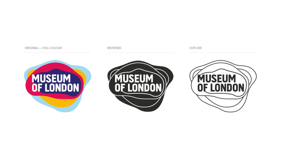
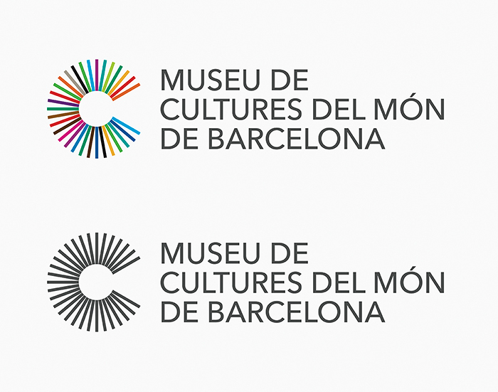
Logos should work in a variety of forms -- video, business cards,
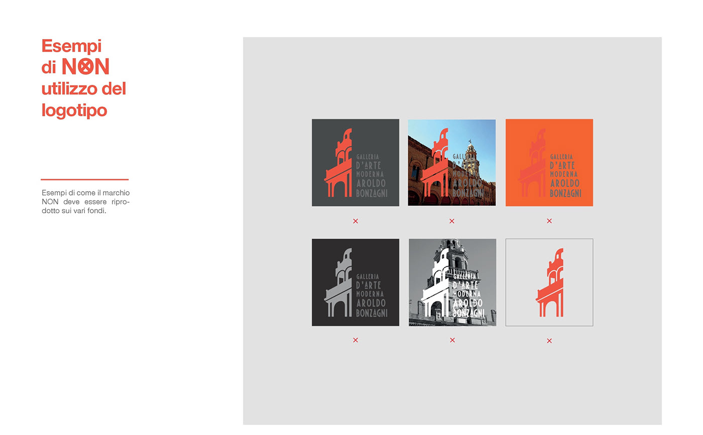
heat stamping, etc. Don't rely on special effects, drop shadows, and other filters which may not always reproduce well in print. These effects can enhance a logo, but your logo should be versatile enough to appear in only
a single color.

Modularity:
Naturally your logo should work at a variety of sizes -- usually if
you can scale it down to 36x36 pixels it will work at any size (even
on a billboard). Try to think of different "variations" of your logo -- can it work with AND without the text? Can it appear on different backgrounds?

Text:
Not always necessary, but can make or break the logo. Carefully consider
fonts and typography. Text "treatments" such as strokes need to be used carefully -- even text by itself can become
a compelling logo when you commit with a degree of seriousness. Don't forget though, you need something memorable!

Distinctiveness:
How does your logo appear with the competition? Is it too similar? Too
different? What can you borrow from existing logos? What should you
steer away from?

Simplicity:
Also could be "elegance" -- is your concept identifiable?
Is it overworked or too elaborately detailed? Keep "readability"
in mind, who is your audience and will they buy into this design?

Color:
While your logo should work in a monochrome scheme, it is also important
to develop and commit to a palette that you will use throughout your
marketing materials. Come up with a color scheme by exploring different
"fills" and "stroke" combinations -- your first
guess may not be the best. Color can be integral to the branding --
think about IBM, McDonald's, or Home Depot!


Descriptiveness:
Also could be "how literal is your logo?" In other words,
does the logo actually contain some imagery or information directly
about the company or product you are promoting? Your logo can be "pictorial," but it can also be more "metaphorical."

Timelessness:
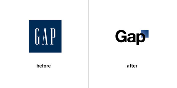
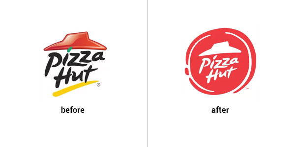
It seems a lot of companies have updated their otherwise classic logos
(have you seen the new Burger King logo?). Try to stay above style if
you can. It's not easy, but think about generating an image that won't
evoke a response like: "Oh, that's soooooo 2012."
Eight Avenues to Explore
as You Create a Logo:
There are essentially eight
factors that can be used in the creation of a successful logo -- of
course, you can combine these approaches with one another, but if you
master these issues, you'll can create a logo for any situation.


LINES/STROKES
How can lines be used to draw out meaning? What does a "soft"
line convey as opposed to a "hard" line? Do the lines creates
edges? Tension? Are they hand-drawn? Are the lines representational
or are they abstract?


SOLID SHAPES (OFTEN WITH PICTORIAL/REPRESENTATIONAL ARTWORK)
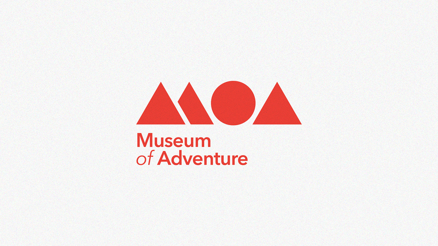
So what happens when you make a line into a solid -- you have shape.
Seems like a no-brainer, but shape is huge -- bigger than you think.
Shape works overtly and subliminally. A circle can convey infinity,
eternity, the body, the eye; a square is most likely rigid, firm, resolute,
solid, dense; while a triangle is logical, geometric, it's about triads
and organized space. Rectangles and ellipses can be unbalanced and therefore
dynamic.
Think about what you can do to set expectations and then break them
-- what happens when you take a circle and alter it? What happens when
a chunk is taken out from a square?


FIGURE/GROUND
We'll continue to address these -- it's the relationship
of the positive and negative shapes and how they generate a sense of
foreground and background.
Classic manipulation of figure and ground can create mental puzzles
-- these are often difficult to achieve on a technical level but the
most rewarding when we uncover their secret meanings. Avoid going too
far off the deep end though, they can appear forced if not executed
with grace.


PATTERN
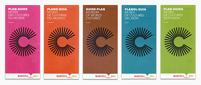
When you create repetition or symmetry you're dealing with patterns.
Patterns can be familiar and recognizable or they can appear completely
fresh. Often they work by playing with the "mechanics" of
vision be juxtoposing shape, color, or percieved texture. This can ultimately
be eye-catching or visaully distracting.

LETTERFORM
Naturally when many of these tropes fail we turn to letterform. It doesn't
mean that's a bad thing, rather it is a good thing to fall back on --
perhaps also using other logo strategies mentioned here. Basic letterform
manipulation relies heavily on type and type treatments. There are so
many things that can be done with type to elevate to "logo"
status these effects seem fairly ubiquitous. Try not to mess with the
letters too much -- you want a "customized" look, not a tweaked
look.


CONTRAST WITHIN THE LOGO
Variations in elements can appear right next to each other. This can
be in the form of letters, shapes, patterns, or any other items. Naturally
this will create a sense of variety and liveliness, but can also draw
attention, develop hierarchy and heighten the level of sophistication.


IMAGE
FIELD
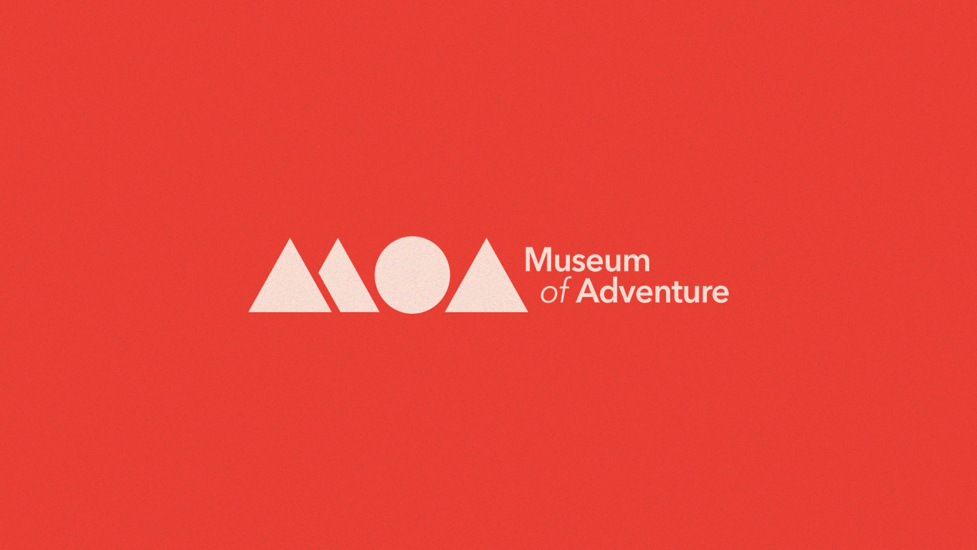
What's your logo's background? Sometimes we get trapped into designing
on white -- so try putting your concepts on a dark surface, reversing
the tones and playing with knockouts. This is related to figure/ground,
but is more simply focused on the surface upon which your logo appears.

PERCEPTION
Quite simply: What is your logo DOING?
The squares depicted above are not logos, rather they depict how even
on a subliminal level you can control a response to your logo. The first
square looks soft or cushioned, the second square appears tranquil yet
straightforward, and the final square has a bit more tension as the
lines break free.

In a logo
such as this, note how the lines here are used to convey solidity and
landmass at the same time. Sure, the United States is also apparent,
but it's doing even more -- there is a sense of movement also. The buildings
also seem to grow upward!
|
