Some examples and issues to consider:
Early Schematics:
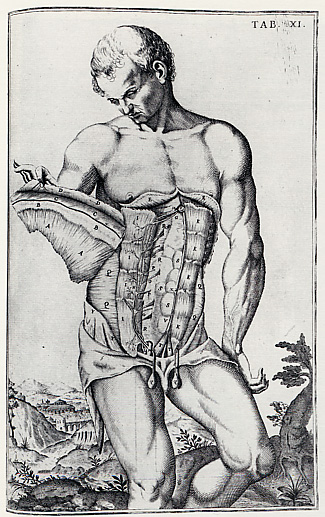
Odoara Fialetti, 1627
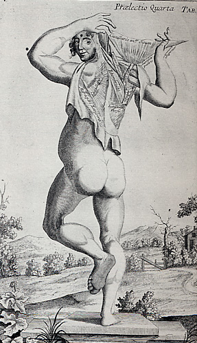
John Browne, 1698
We've seen Leonardo's drawings, but
what about these anatomical studies?
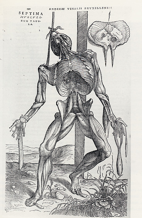
Stephan Calcar, 1543
Somehow seems morbid, but culturally how
does it relate to today?
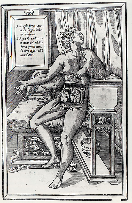
Francois Jollat, 1545
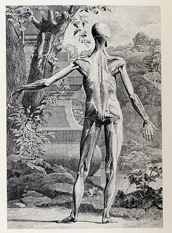
Charles Grignion, 1749
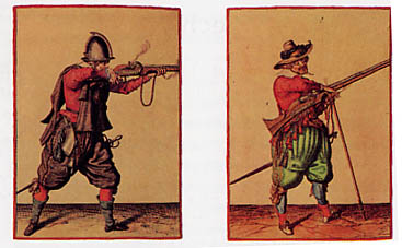
From the 16thC
The sinister side of classification/diagramming:
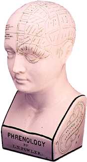
Phrenology:
The study of the skull and its
relationship to personality traits
and mental faculties
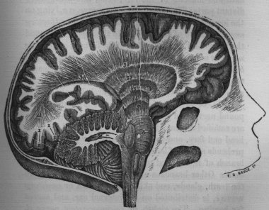
Does the shape of the brain translate to the skull?
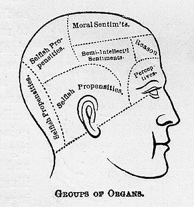
Knowledge is power, right?
What if we could classify a person by the
shape of his/her head?
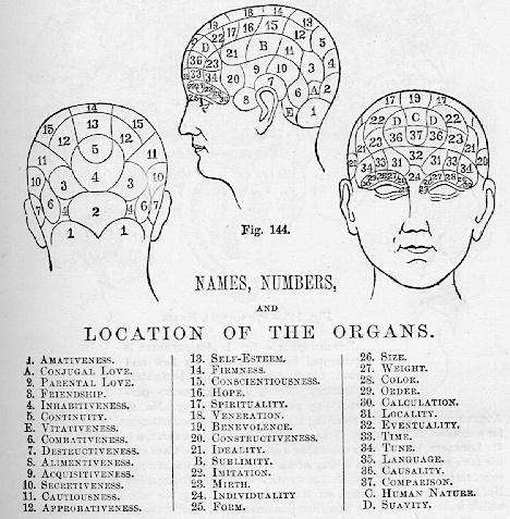
More systems mapping your head...
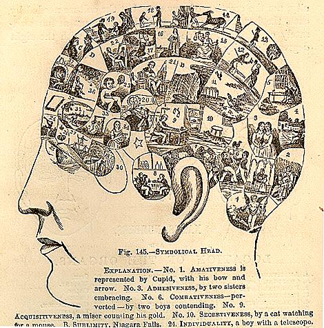
An interesting depiction with miniature graphics...

Franz Joseph Gall (1758-1828)
"Founder of Phrenology"
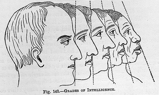
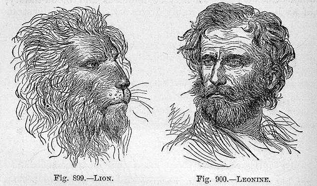
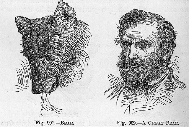
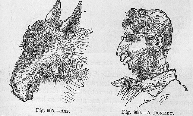
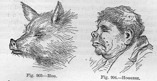
Enough with the pseudo-science...
Getting more up-to-date, 1920
Design Techniques:
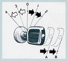
Conveying movement over time...
Does it make sense?
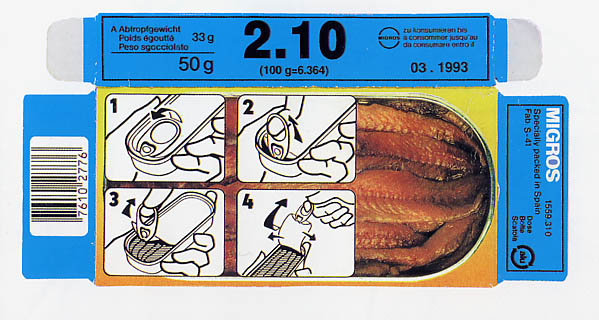
When do you use an arrow, and when do
you use a finger?
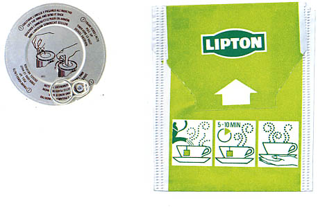
Nice line art -- works even on a tiny scale!
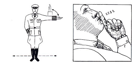
Time, movement, and sound.
Interesting that a colloquial gesture for "quiet"
is employed in a drawing here.
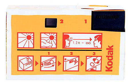
Simple inages convey a large amount of information
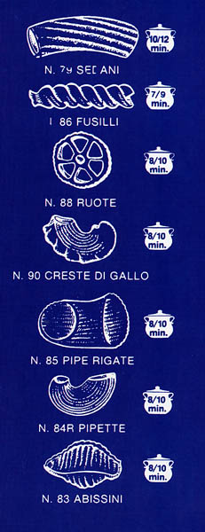
Nice "knock-out" concept,
Perhaps a bit redundant?
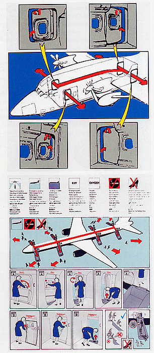
Classic airline art
Also, imagine how it would appear as grayscale...
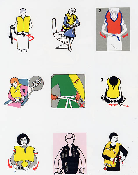
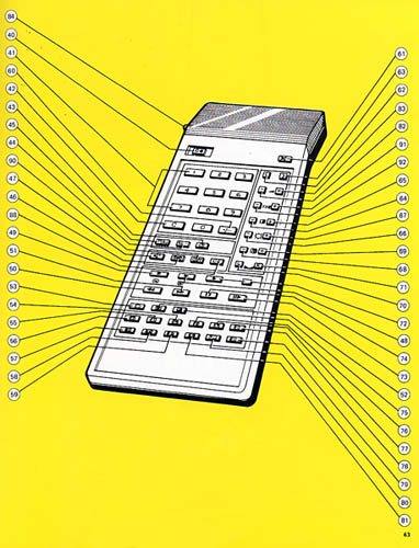
Take a closer look at some of the techniques
Why do they always look so happy?
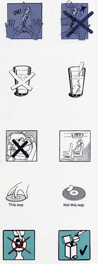
How do you tell someone NOT
to do something?
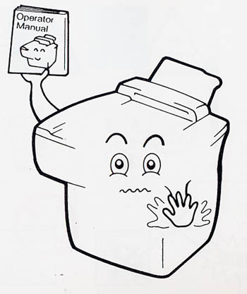
What is this about?
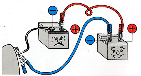
Don't make the battery sad!

The "star" is universal -- a graphic flash
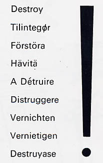
The exclamation is also fairly universal...
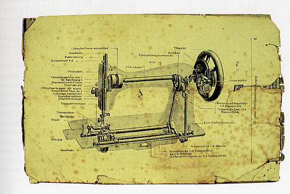
Interesting nomenclature concept...
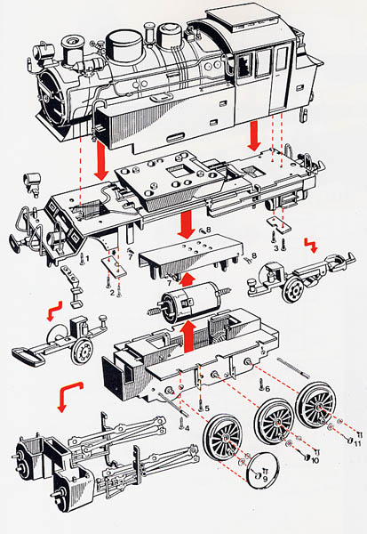
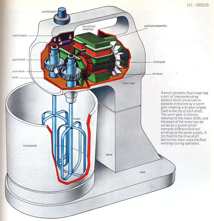
Another exploded view
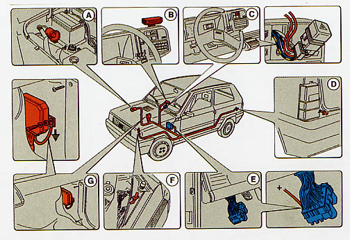
Thought-bubbles frame the central image
forming an interesting layout

Basic clean line art -- well articulated and
worth aspiring towards...

Here again, the dotted-line appears to
indicate movement and time
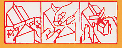
Seems straightforward in a tiny package
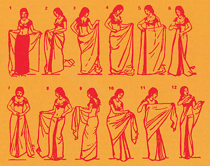
Nice graphics and twelve steps!
(Note the lack of frame, too)
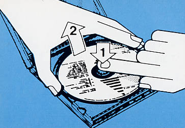
Oh -- I wondered how to get those out...
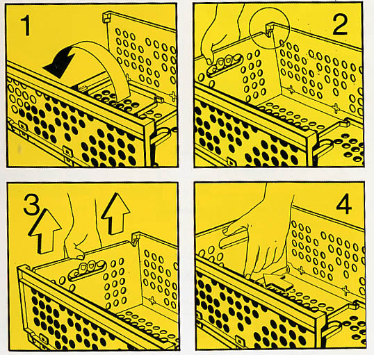
What changes and what stays the same?
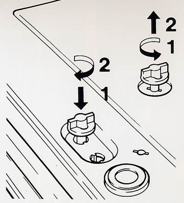
This makes no sense!
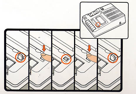
The frames are a bit small, but they look cool,
and the master image is a nice touch
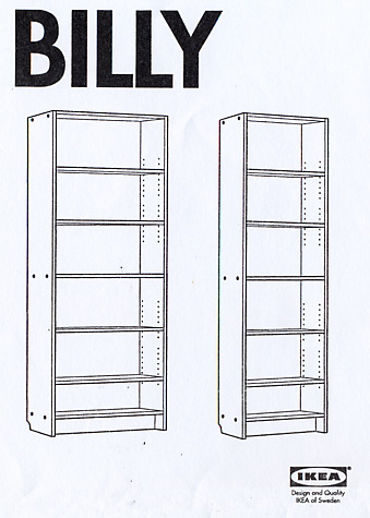
Good old Ikea...
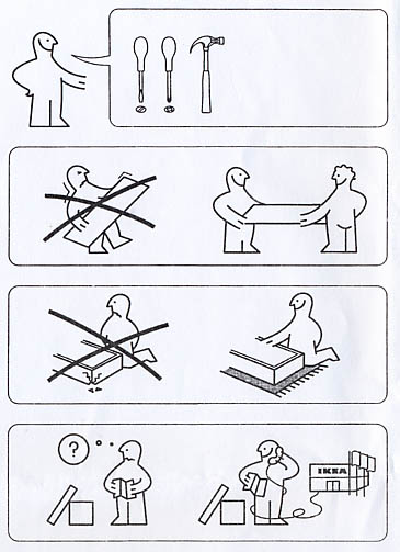
What does this say?

The inventory
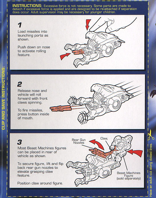
I couldn't resist these...
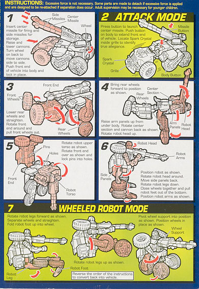
Cool use of color -- and sense of movement
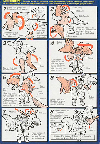
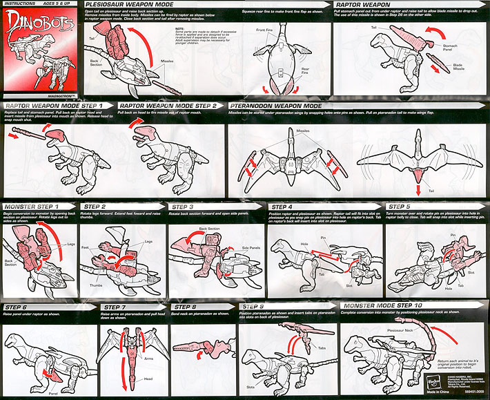
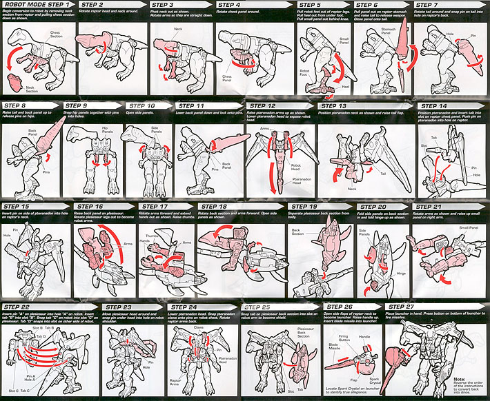
Is it worth 27 steps for this thing?

How about this -- can you follow the logic?
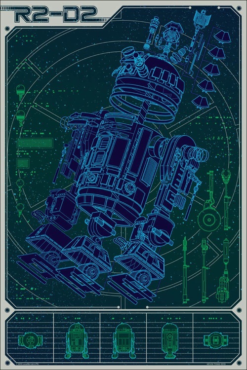

We'll be getting into more of these issues
in the next class...
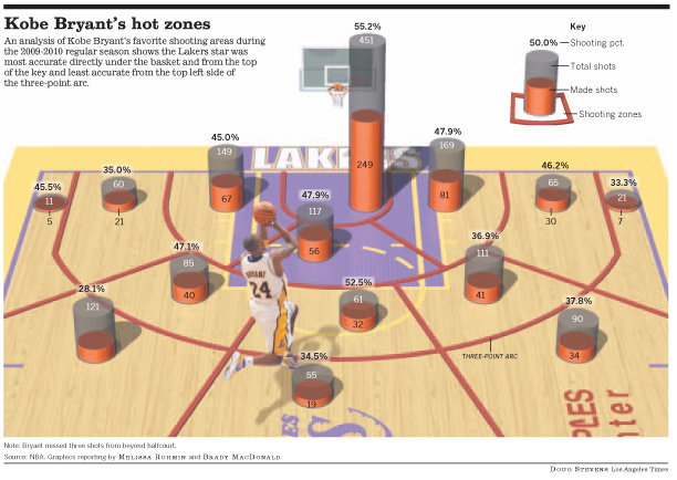
How does something like this:
|
Compare to this:
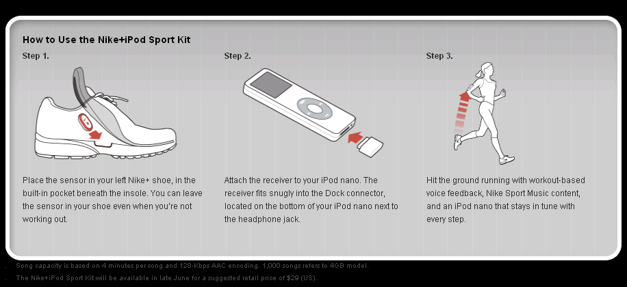
The classic "how-to"

Now fully up-to-date
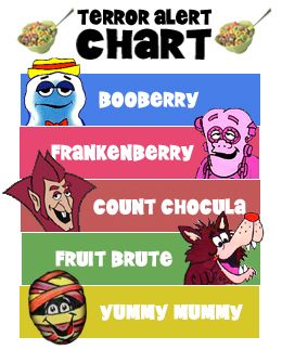
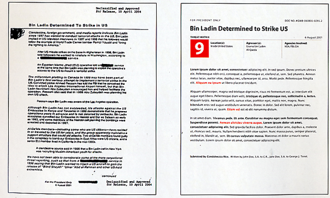
Some Spin-offs:

Final Thought:
Could better information design have
"saved the day"
- - - -
In-Class Challenge
Use this image:
