

Today:
We get into gradients...
And color...
But first!
Some examples and concepts for discussion:
| When considering the conceptual issues behind your project, you might take into consideration this real world example:
The art historian Ernst Gombrich offers an insightful commentary on this:
Even the sight of the awkward naked figures in the illustration cannot be separated in our mind from our knowledge. We know that feet are for standing and eyes are for looking and we project this knowledge onto these configurations, which would look 'like nothing on earth' without this prior information. It is this information alone that enables us to separate the code from the message; we see which of the lines are intended as contours and which are intended as conventional modelling. Our 'scientifically educated' fellow creatures in space might be forgiven if they saw the figures as wire constructs with loose bits and pieces hovering weightlessly in between. Even if they deciphered this aspect of the code, what would they make of the woman's right arm that tapers off like a flamingo's neck and beak? The creatures are 'drawn to scale against the outline of the spacecraft,' but if the recipients are supposed to understand foreshortening, they might also expect to see perspective and conceive the craft as being further back, which would make the scale of the manikins minute. As for the fact that 'the man has his right hand raised in greeting' (the female of the species presumably being less outgoing), not even an earthly Chinese or Indian would be able to correctly interpret this gesture from his own repertory.
(As
discussed by Daniel Chandler in Semiotics for Beginners) |
Consider the Following Technical References:
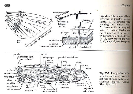
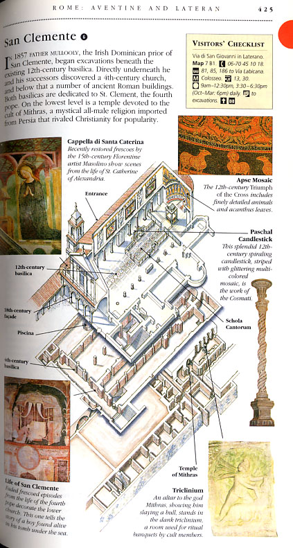
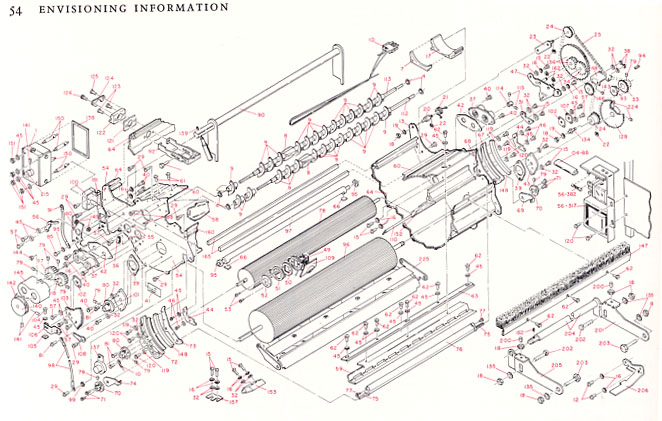
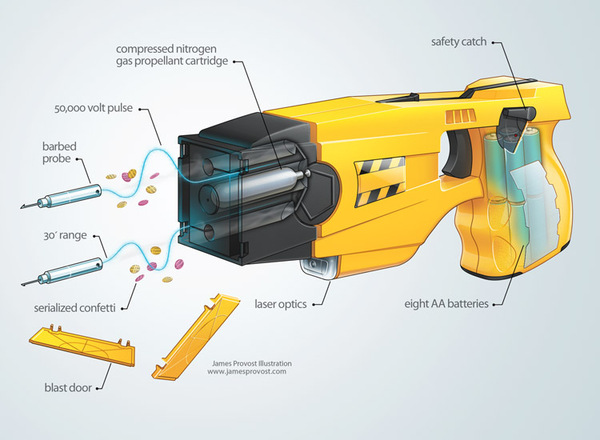
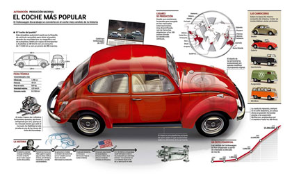
Technical drawings which use "cut-aways"


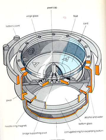
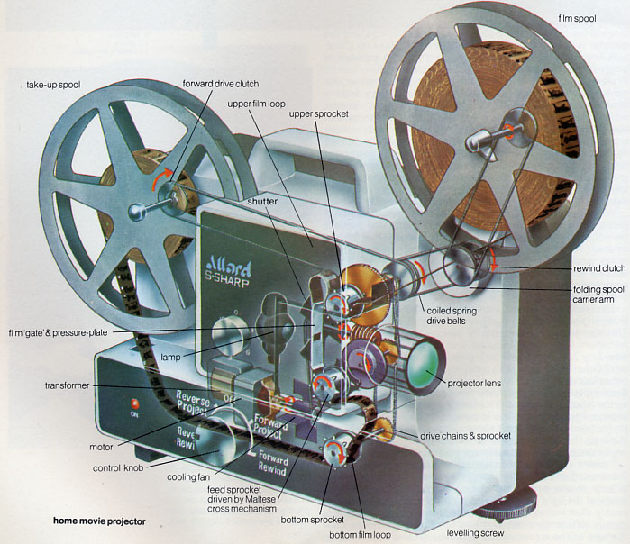
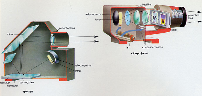
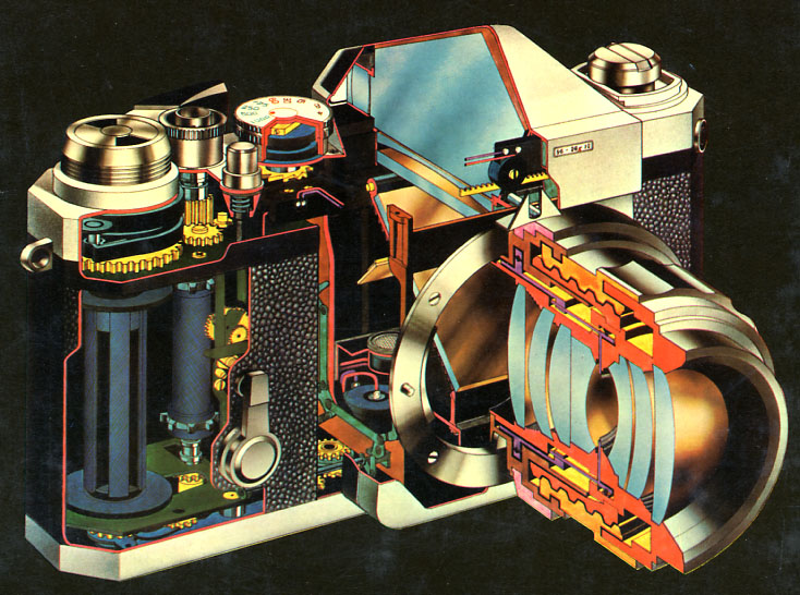
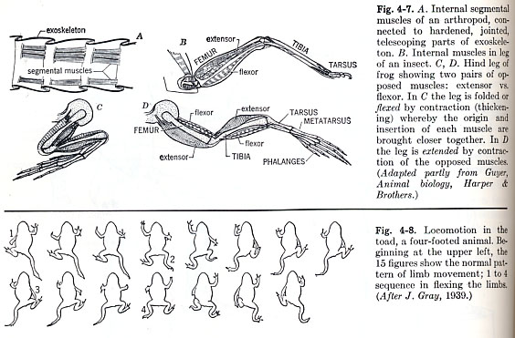
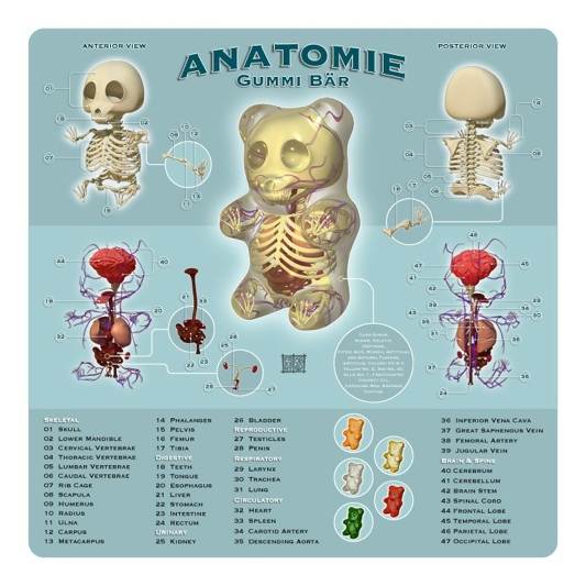
Biological Drawings which use outlined images
with some degree of detail and shading

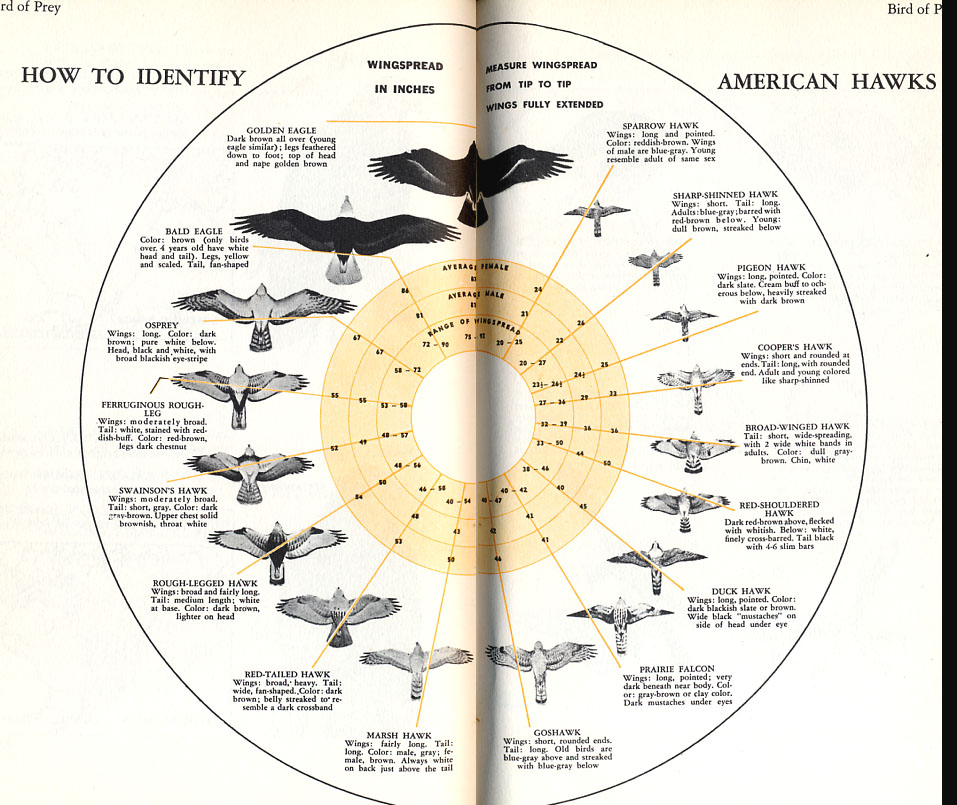
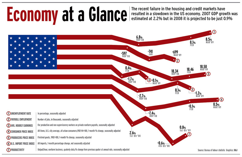
A great example of an unconventional layout:
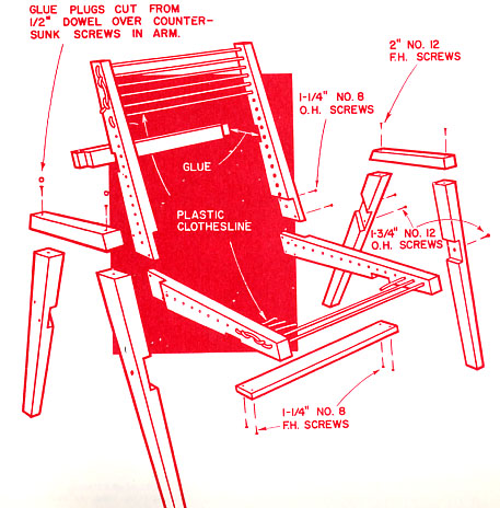
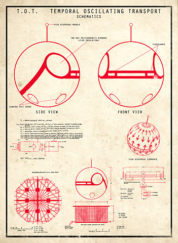
These images use a "blueprint" style
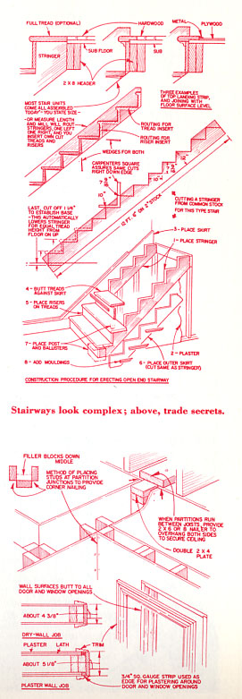

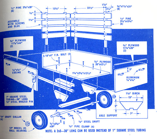
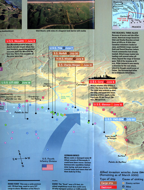
A typical National Geographic map:
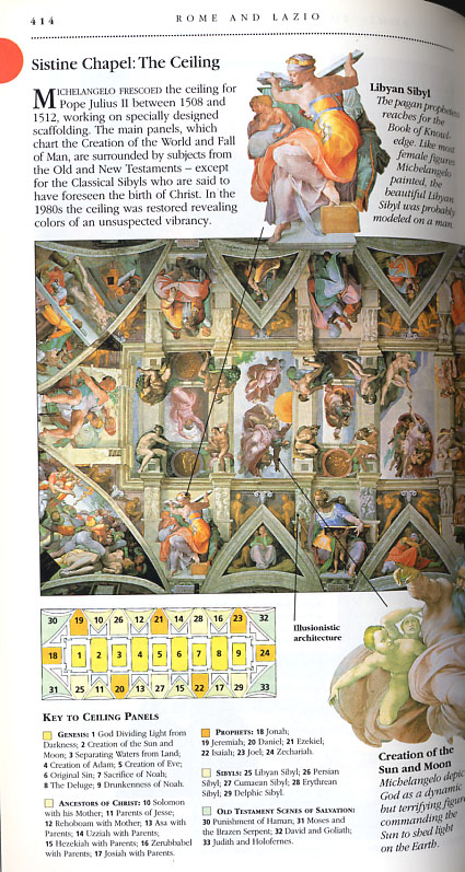
Travel Guides by DK Publishing






Artist/Designer Jason Freeny

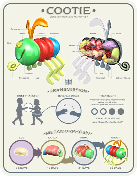
"Information design," as a genre, is having a resurgence of sorts;
consider "Good Magazine" (follow the link).
Further technical investigations...