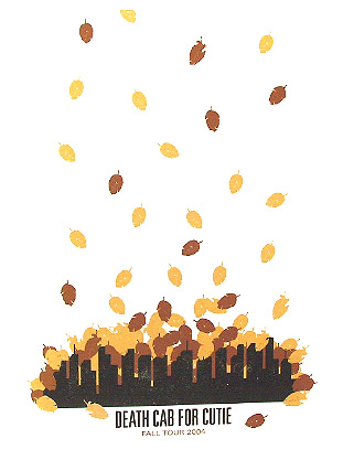
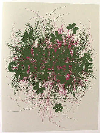
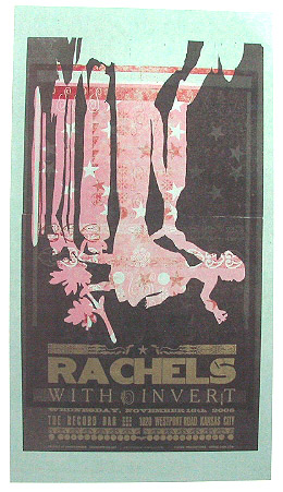
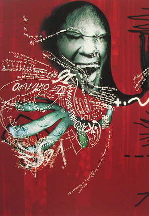
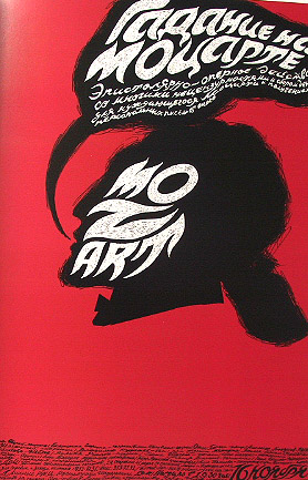
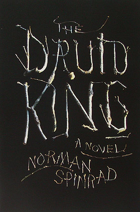
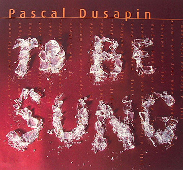
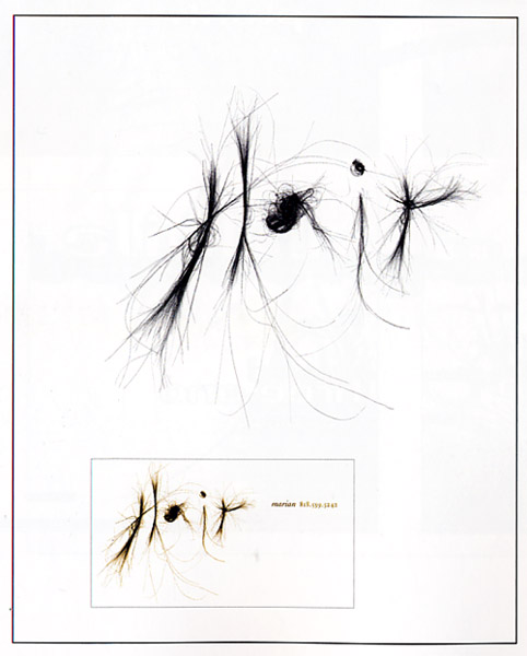
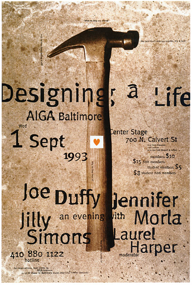
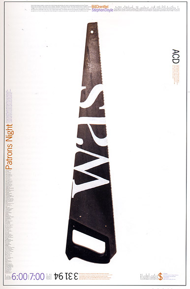
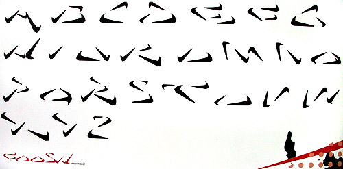
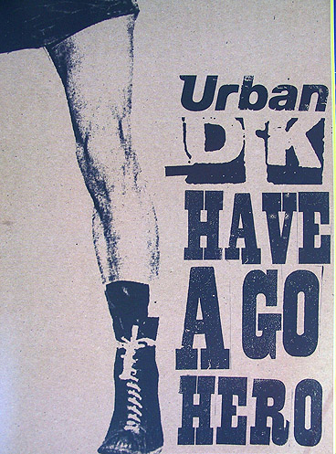
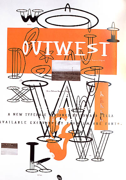
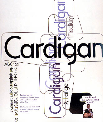
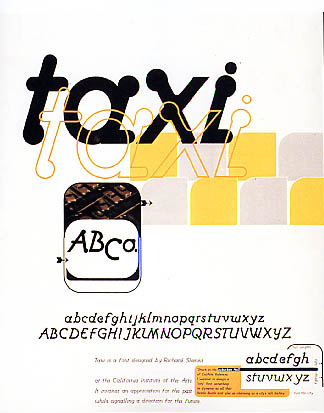
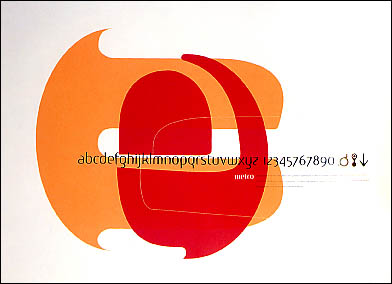
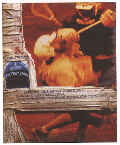
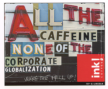
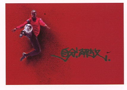
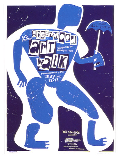
Keep in mind, these are not designed to be "random," rather you are exploring the possibilities of "synchonicity." In other words, how will your ideas criss-cross with one another and take you into compelling new places?
Ingredient One:
Take the FIRST word and plug it in to CI’s library database “Quicksilver”, and do a “Subject” search based on that word. Look at the results and choose one book from the list – don’t worry about the subject, just pick one that stands out to you for any reason. It may be a subject you have no clue about. Now go get it and check it out from the library!
Flip through this book – look at it, get the feel for it. Maybe it’s dense, maybe it’s got lots of images? Add up the numerals from the date of your birth (2/2/85 = 89) and flip to that page (If there are fewer pages, just take the month plus the date). Find a sentence or phrase on this page that catches your eye.
Use this sentence in your one of your page spreads – lay it out digitally as part of the design in a font the COMPLEMENTS the typeface you are developing. (You can also scan and use any other parts of this book in the poster)
Keep this book through the length of your project and let it become part of your production. Sure, there could be images in the book that you use, but even if it's purely text, figure out how this book can integrate with your design direction.
Ingredient Two:
Go to Google maps on the web – type in the SECOND word that you came up with. What comes up? (I typed in “Scratchy” and “Scratchy’s Auto and Truck Salvage” comes up in some town in Missouri!)
Look at the results and choose town or business that seems interesting to you – let this become another significant part of your art direction for this font. This will be the art direction for your spreads – the look, the feel, the vibe – go with it.
Even if you find it odd, or unexpected, or in contrast to where you want to go – see where this will take you! Be creative, and come up with a way to bring this into the project.
Ingredient Three:
Take your THIRD word and look it up in the Apple thesaurus. Choose one of the synonyms that you think is interesting. Now take THAT word and do a Google image search. Take the number of pages in your library book and divide by two (if it’s an odd number, divide by two and round up!). Go to THAT photo on your search. GET THIS PHOTO and save it, place it in your InDesign research file on a new page.
Use this photo to help generate a PATTERN that you will somehow integrate into your poster. This pattern can be vector based (a drawing extrapolated from the photo?), or it could be a photo-based pattern.
When you have your pattern, place that on the same page in your InDesign research document.
Ingredient Four:
Your new font will need a name – and it can’t just be any name! Take the FOURTH word and do a search on E2 (http://everything2.com/). If nothing comes up, use the FIFTH word as a back-up. (Note: This website can be a little "PG-13" with some of the subject matter, i.e. it's a little edgier than Wikipedia.)
Scroll down and look at the links/nodes at the bottom of the page. Click one that seems interesting and go to THAT page.
Now, somehow derive the name of your font from this page and its contents!
Good luck!

