The Critical List for Your Book
By now parts of your book should be taking shape. You have the typeface, and you have a few requirements for "ingredients" to include.
Here's what you have so far:
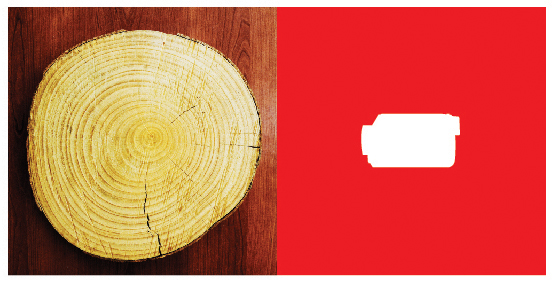
1 Mask-Based Spread (2 pages)
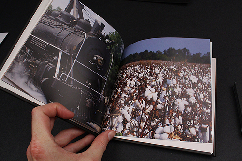
1 Sense-Based Spread (2 Pages)
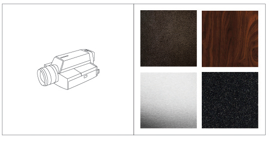
2 Grids Exploring Thrift Object (2 Pages)
1 Totally Abstract Design (1 or more pages)
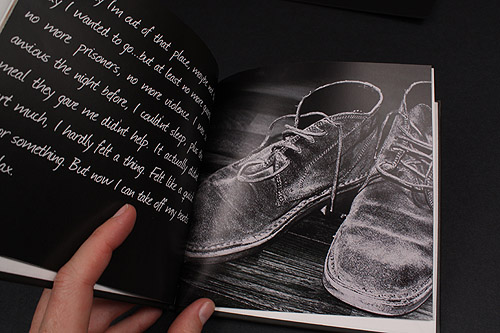
Penguin Crime Cover Art (1 or more pages)
8 pages total...
So what next?
On to the Final Elements:
In creating your design, you can occupy the remaining 20 pages (or more) with any number of design elements. In fact, you can actually do whatever you want! Of course, it should still revolve around this "world" of your typeface.
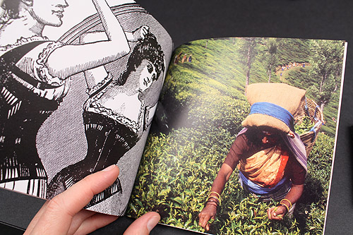
If you want to curate full-bleed photos? That's great!
You want to include more of the "senses"? Fantastic!
-- BUT --
In the midst of your design, you must also include 7 of the following "optional" ingredients:
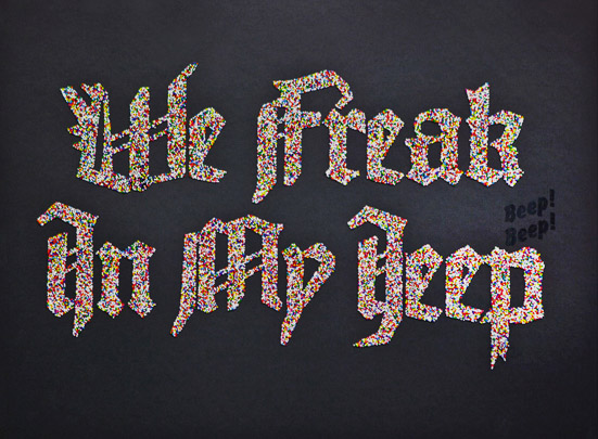
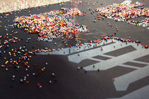
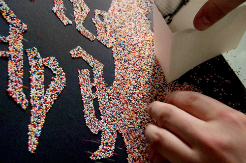
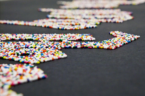
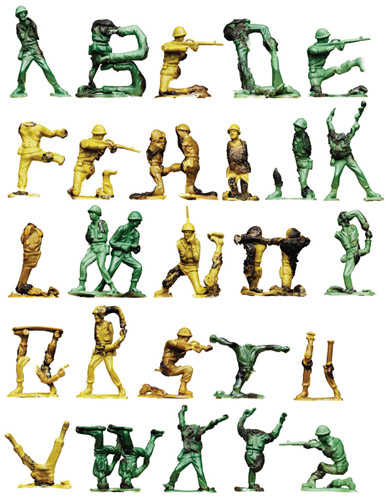
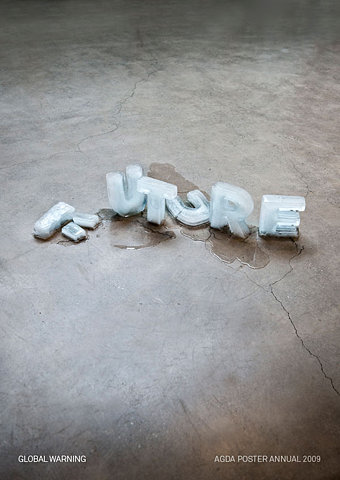
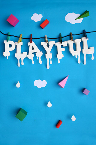
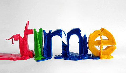
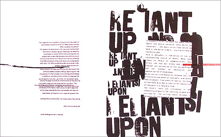
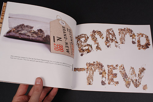
- An "analog" recreation of a word or portion of your typeface. This could be done via stencil, paint, potato stamp, drawing, clay mold? Whatever you want, but somehow recreated in the "real world".
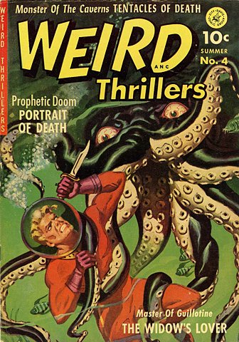
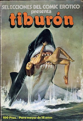
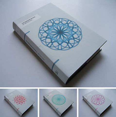
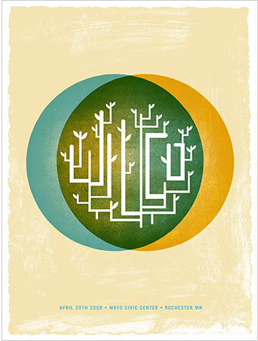
- A concept for a "book cover design" or "movie poster" which somehow uses your font. The actual book should be strategically chosen -- think about a particular book that would take advantage of your art direction, or a book that would lend itself to an interesting design. You could include the basic design, or your could integrate the book (via Photoshop) into a scene.
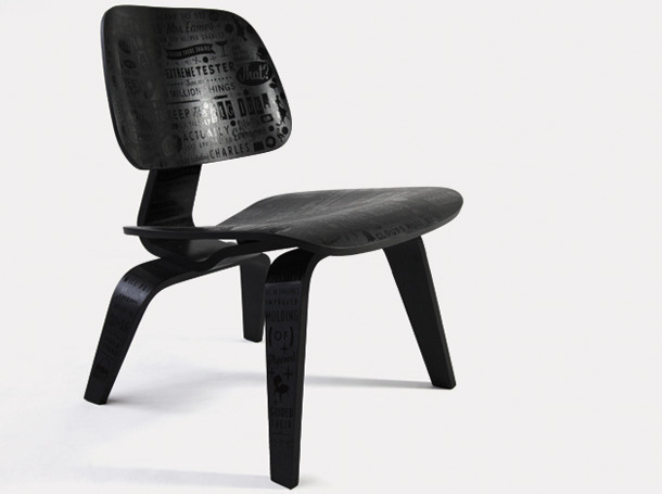
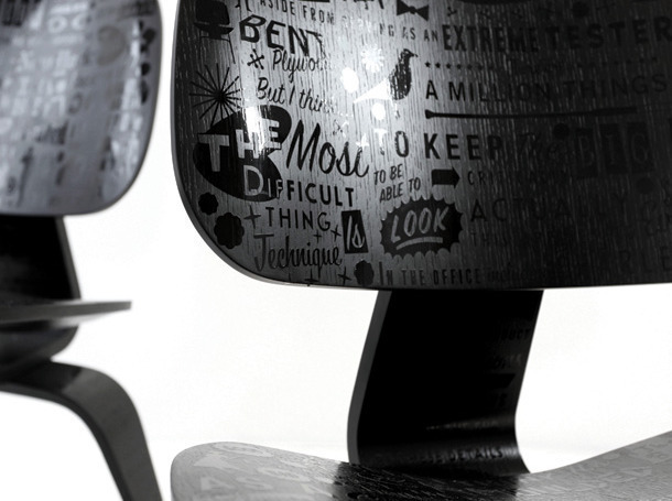
- Design an item of apparel which uses your typeface. This could be anything from a T-shirt to a bag, shoes, accessories, whatever you think would work.
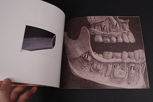
- Develop an interesting "Art History" crossover that somehow connects your font/object with the art historical canon.
- Capture an instance in the "real world" in which your font could somehow be working (could be created through Photoshop).
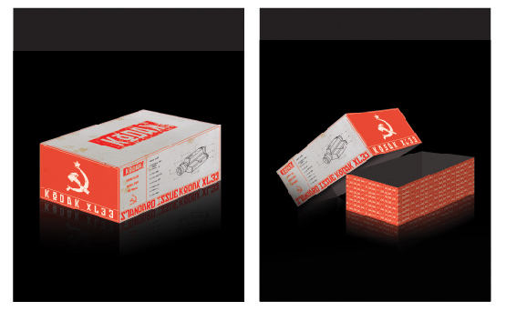
- Create a hypothetical package design for a product that is somehow related to your tyepface and/or object. The package can make extensive use of your typeface, or minor use, but the actual product should be something that connects with your art direction. The package can be something "mocked-up" in Photoshop to look like a functioning package.
- Combine your art direction and parts of a scanned in newspaper in order to create an interesting design. Create a montage, collage, or some other sort of design that somehow uses only the newspaper in adding to your art direction.
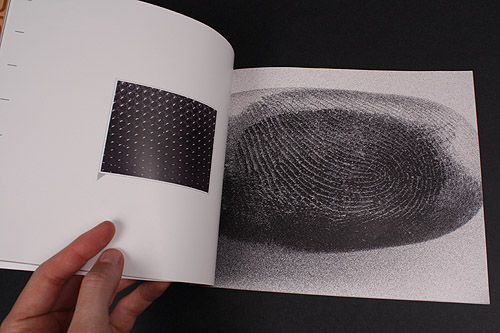
- Design a page that further explores the textures and images from your thrift store grid
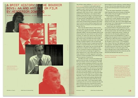
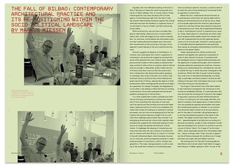
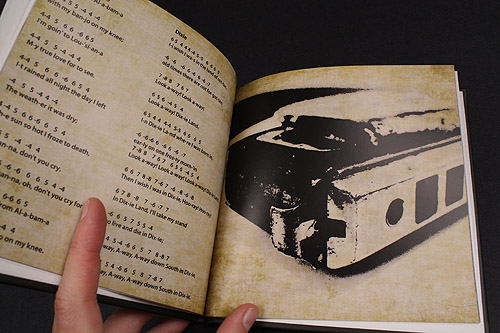
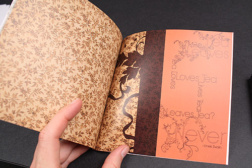
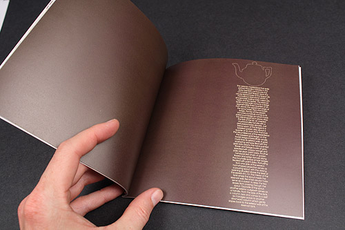
- Curate a body of text that fits into your overall art direction. This could be from a story, a song, an article, any source you find interesting. It does NOT need to be laid out in your font -- it could be in any typeface you find interesting. Lay out this body of text in a way that adds to the overall look and feel of your project.
- Create a logo for a company that uses your typeface. The company can be real, or something you make up -- as well, the logo could appear in a setting (via Photoshop), or it could appear cleanly on the page.
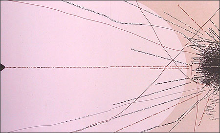
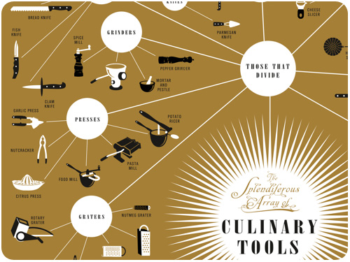
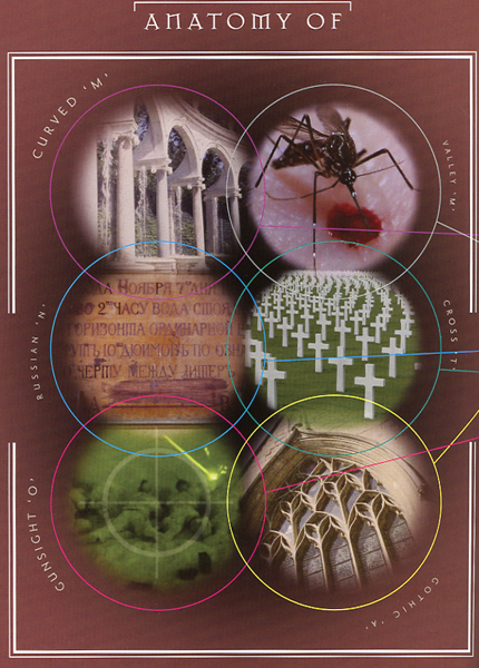
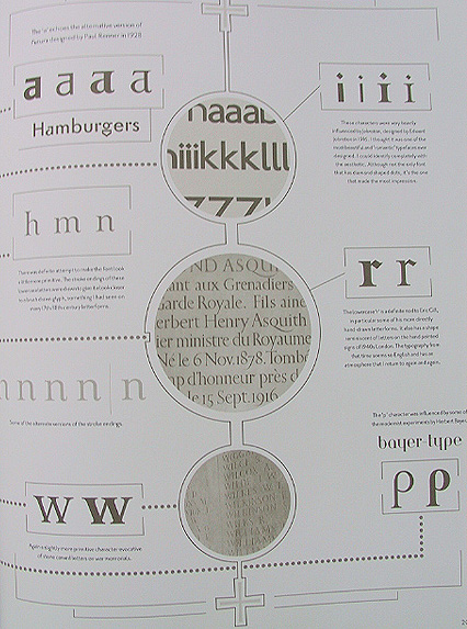
- Include a technical diagram that somehow explains the intricacies of your typeface. Explain the architecture and subtleties of how your design actually goes together.
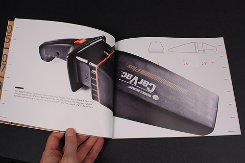
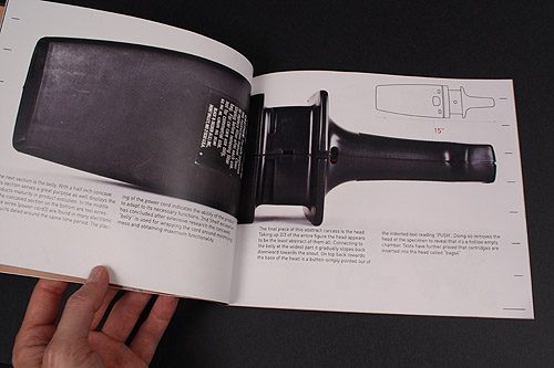
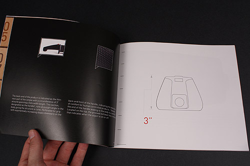
- Create a technical diagram showing how your thrift store object could be used
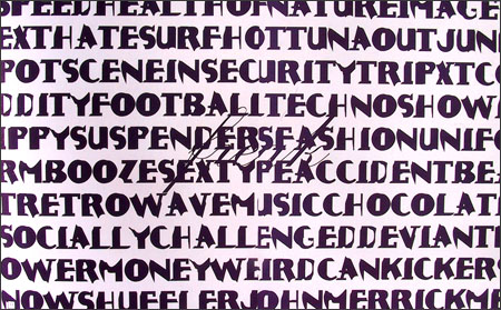
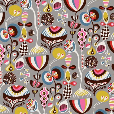
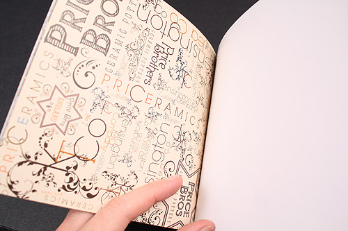
- Create a wallpaper or pattern of some sort that RELATES to your typeface (does not need to USE the actual font).
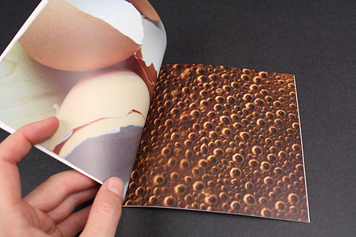
- Curate a series of "textures" (wood, gravel, asphalt, concrete, etc.) that relate to your art direction.
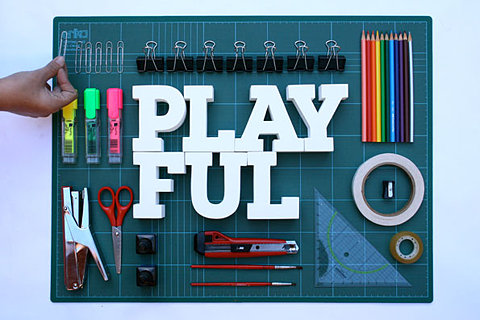
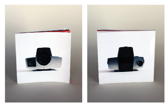
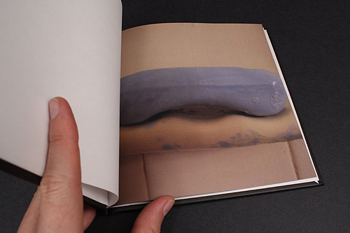
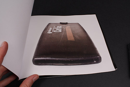
- Find and nicely photograph an object (or series of objects) which somehow relates to your art direction. Include these photos in your project either as pure photos or integrated as designs.
You have all sorts of options when it comes to integrating these ingredients.
The idea here is not to change your project, rather to see how these elements will work with your own interests, and how they can fit together seamlessly into your book design.
Please ask if you have questions or need clarification. Some of these are easier than others, but regardless, you'll need to be creative when it comes to integrating them in your design.
Beyond these ingredients, you have total freedom in the design -- whatever else you create is up to you!
Some ideas for additional clarity...
|
