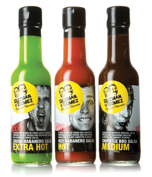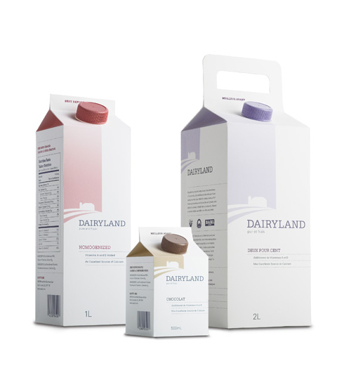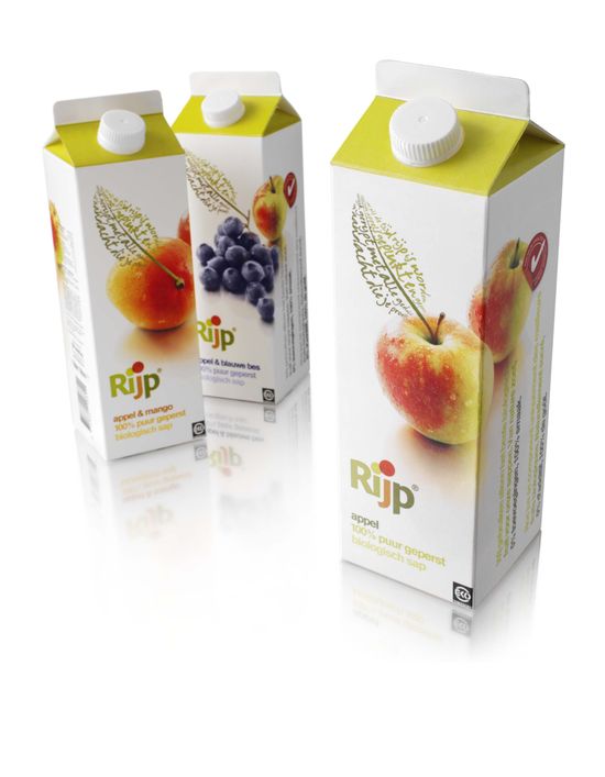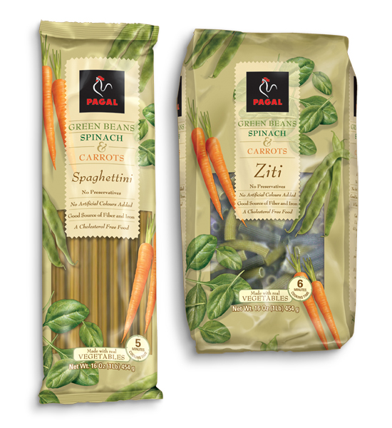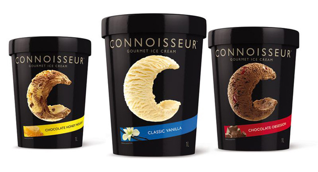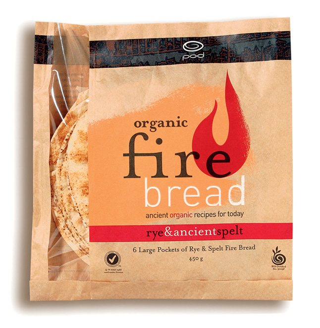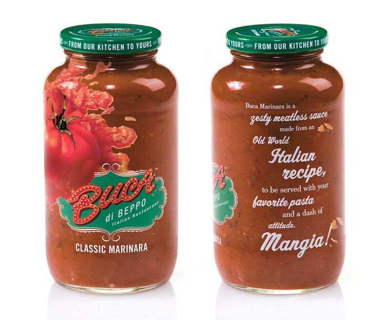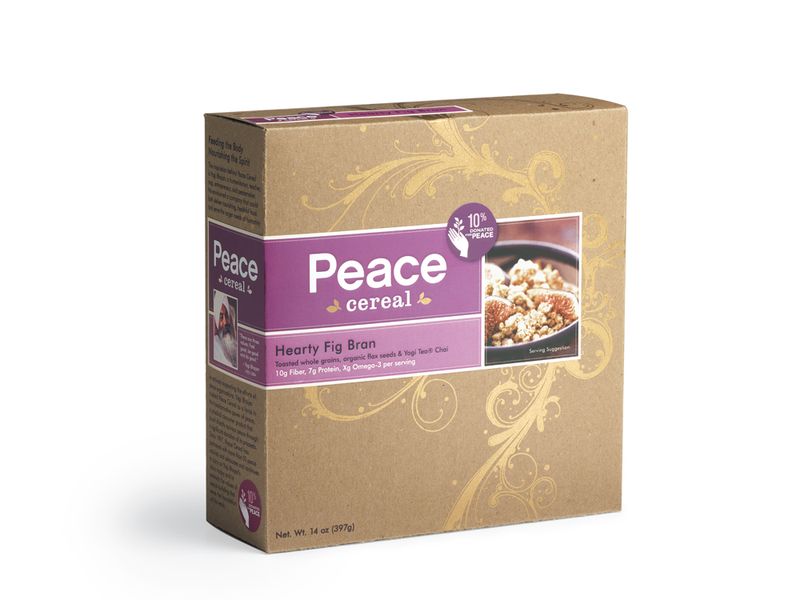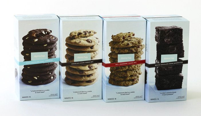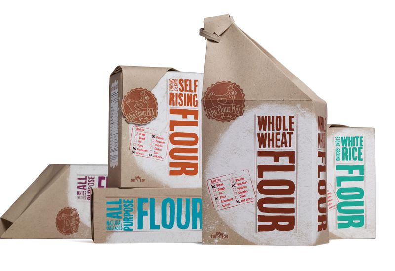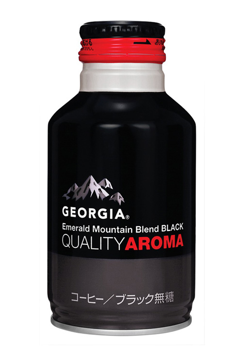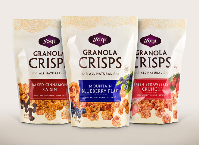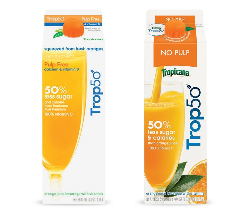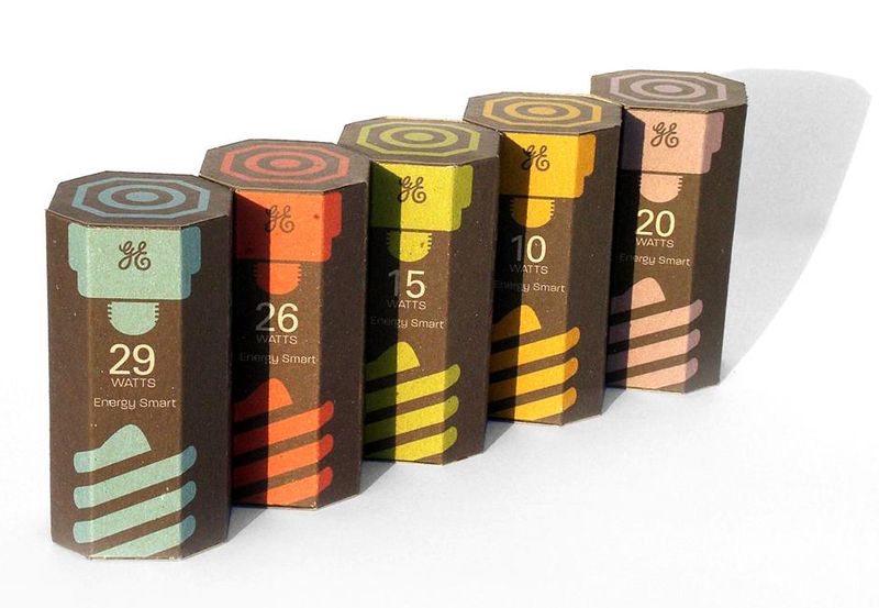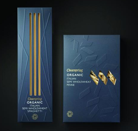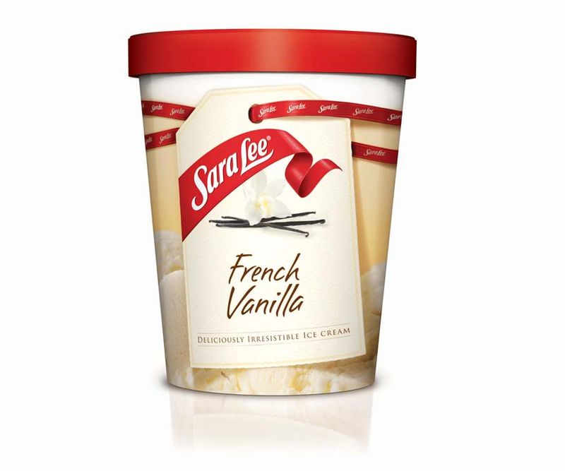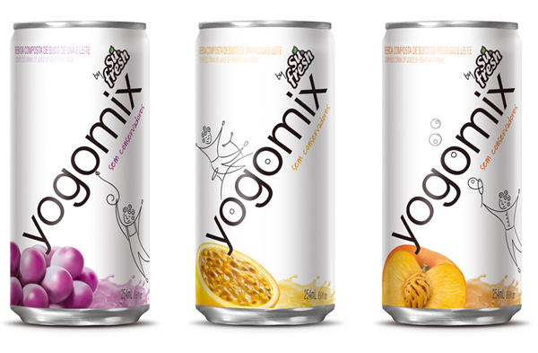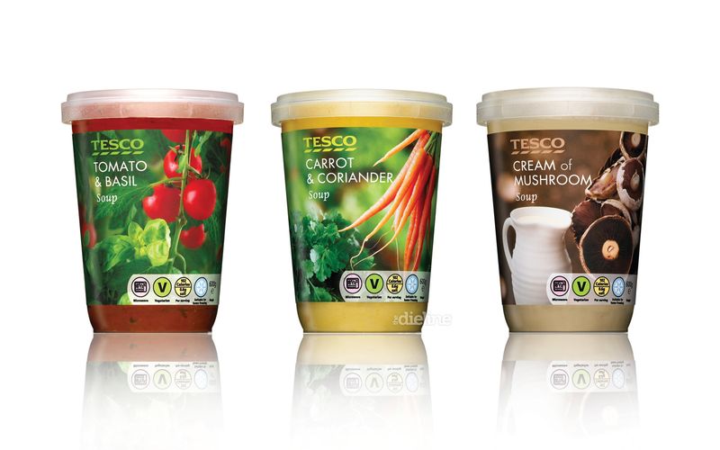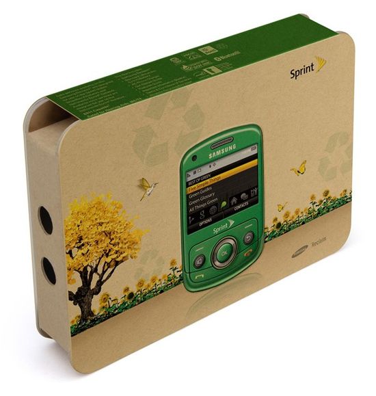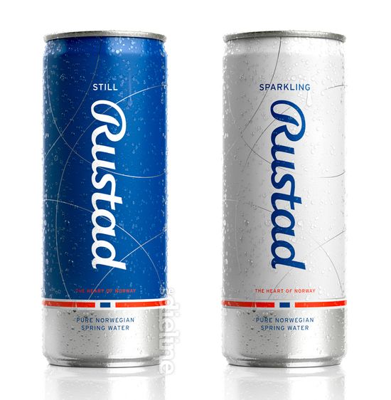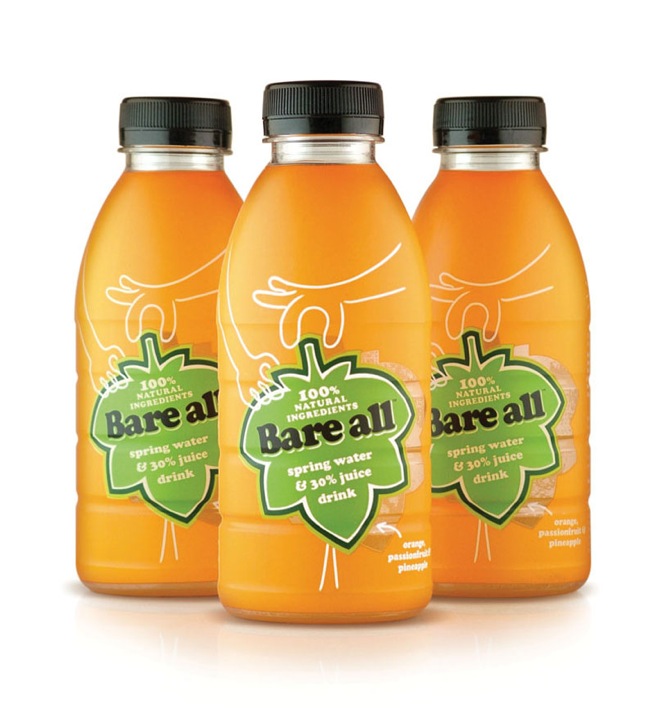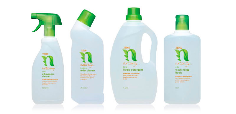
"I ain't afraid of no myths..." For this in-class investigation, we will spend a bit of time "deconstructing" the nature of some packages which are already out there. Breaking in to pairs, and based on where you are sitting in the classroom, you'll be matched with one of the intriguing packaging designs below. Please download the image, and using InDesign, create a "breakdown" exploring the meaning behind all of the design elements that we are seeing. Imagine something like this: |
|---|
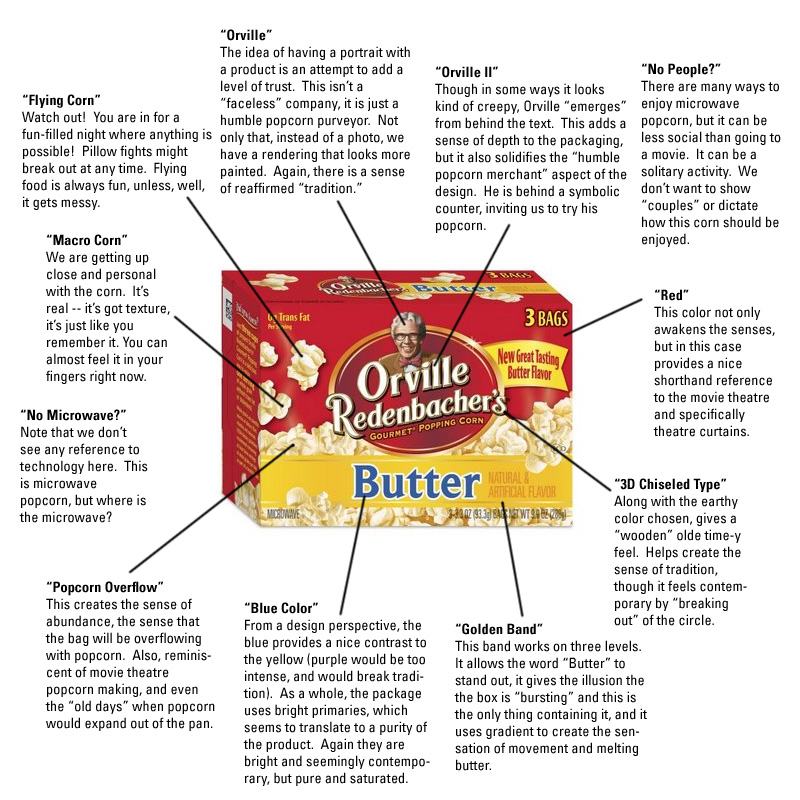
This is just a start! See if you can uncover TEN or more elements to the design. Naturally, some are more challenging than others... Also note that you can point out things that are NOT a part of the design. In other words, look up an image of a similar product for a direct comparison! By the time you are done, you may find that many of these myths are actually related, and that they start to form the real narrative of the piece. With old Orville above, even in viewing just a small sampling of design elements, we start to get a sense that they are trying to harness a merger of "tradition" and still "contemporary." In other words, the design elements try to allude to the company's longevity and perhaps even the history of movie-going, but they've added subtle twists to keep it looking up-to-date. * * * * * * Think about design issues -- color, composition, stylistic elements, historical references, references to other types of products -- consider all of the products mythological makeup. We will look at your results in class today, so get started busting some myths! Here are the designs: |
|---|
