One of the challenges of this project is to take aspects of the "real" world and translate them to a "2D" space. You will atttempt to capture and map time... Of course, as a designer we are doing this all of the time! We are always trying to communicate intangible ideas through design. For the background on this project, I'd like you to consider how data and information can be transformed using design. Charts and graphs, as well as large blocks of text can be problematic, so how can we -- as designers -- spice things up? We know that we can use "pictures" and familiar graphic techniques (lines, arrows, etc.), but how else can we map the passage of time? What about using space and composition? These are also what we'll be considering. Remember that at its core, map must somehow guide the way in unfamiliar terrain, and to a degree, you have to imagine someone navigating your information for the first time... As well, remember you want to avoid taking things that are lively and dynamic:
Into something like this:
|
The classic -- so iconic, so recognizable...
We
can see how easy it is to layer information -- suddenly we
have more information present.
This information is juxtaposed directly against a specific location.
We have "constants" mapped against "variables."
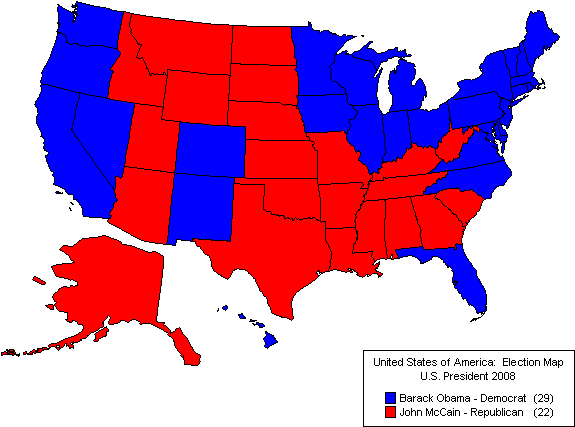
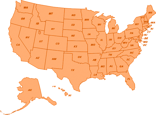
Another iconic map...

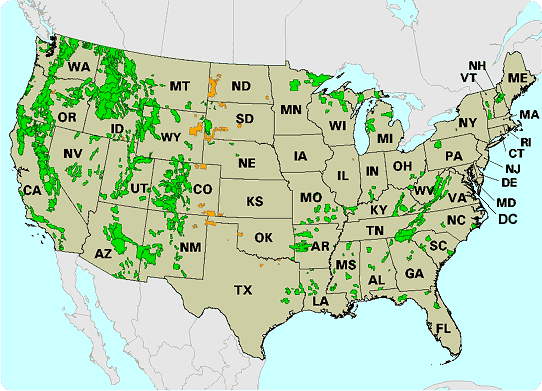
We
can see the limitations of the latter map, and actually how
it can be used to sway public opinion
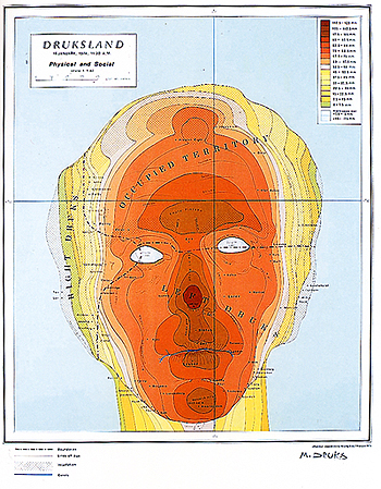
What could this possibly represent?
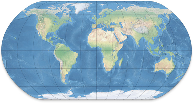
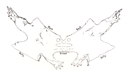
Another classic -- but what's wrong here?
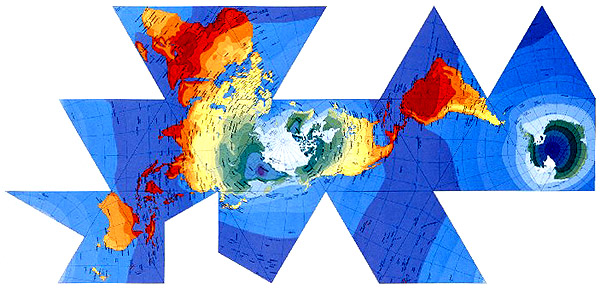
Buckminster Fuller created this map -- what is the significance?
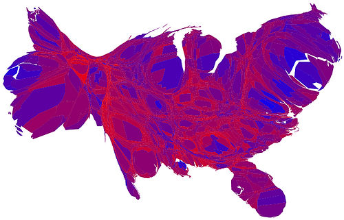
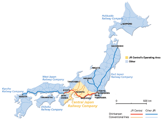
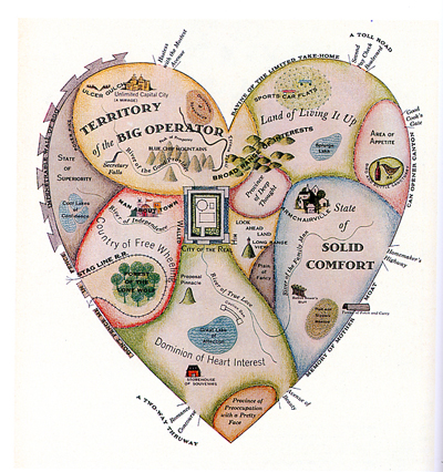
How
do these maps differ?
How do these use "constants" and "variables" in
a more compelling way?
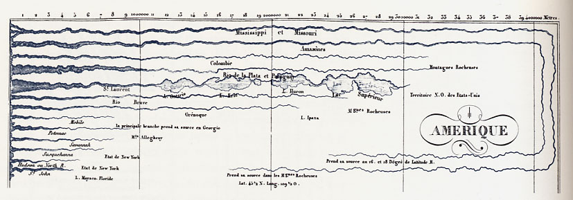
Smaller scale -- note the aesthetics...
Notice what this map is really communicating
You may have some challenges if you wish to achieve
these sorts of
subtle "vector effects"
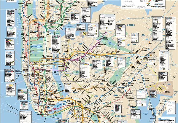
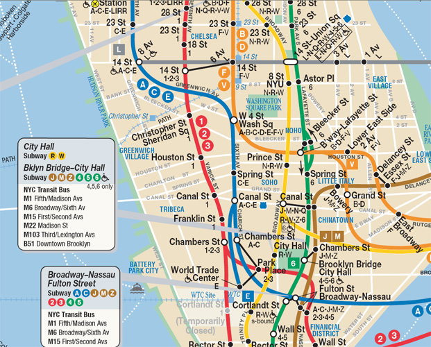
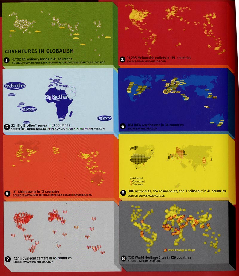
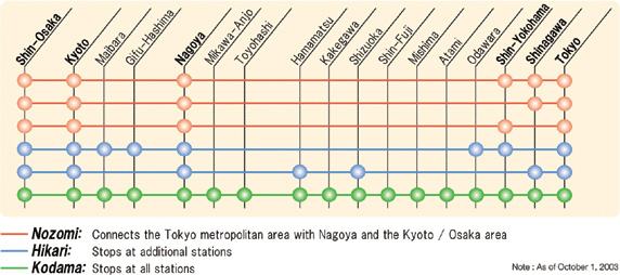
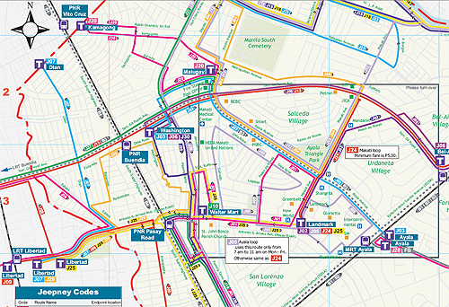
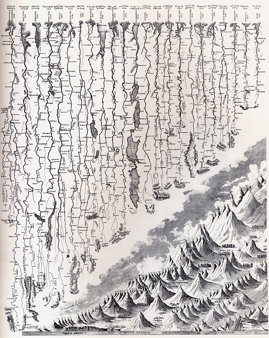
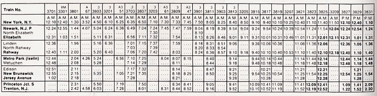
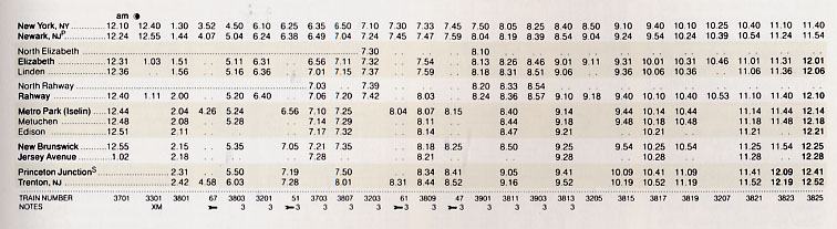
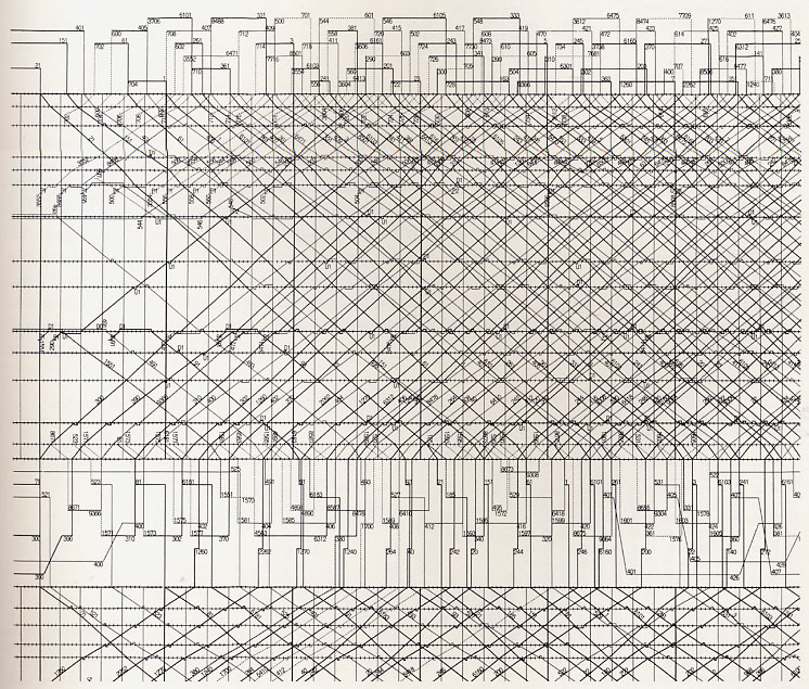
Note
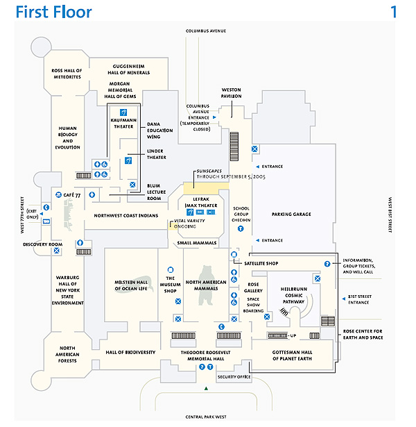
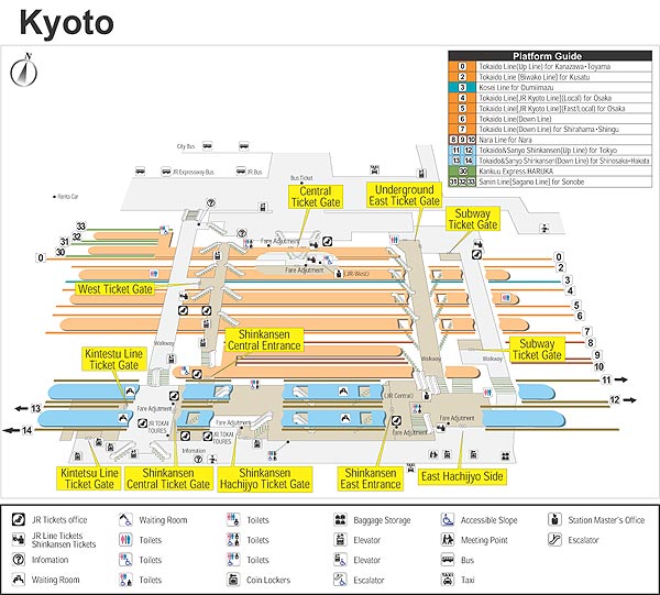
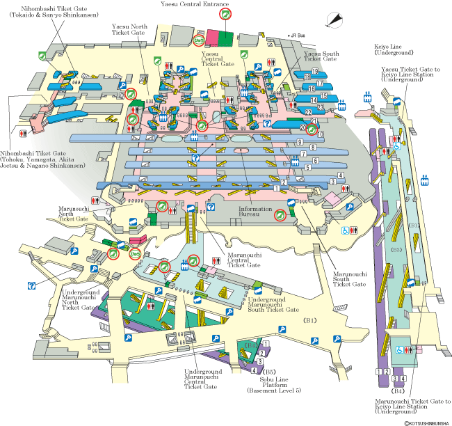
the amount of information in such a small space --
how do the designers keep things straight?
As well, there is the "key" or "legend" which aids
in deciphering the map and adds information
Perhaps you will use a key?
How
do you control eye movement -- direct your audience around
the page? You will have a large "long" space to address -- how
will you compose the space?
It may be important to "map" out your project ahead of time!
Again, perhaps
you have some sort of "legend" -- or a place where
we can find out information about your subject?
You may be able to use a sort of "avatar" or "icon" that
repeats in your piece -- perhaps the key will help
in translating information?
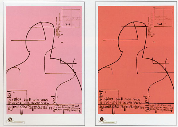
Subtle
3D effects give the sensation of space, and direct
our attention to specific areas
You can use drop shadows -- but remember, only
scanned in media or original photography...
In
these images we see very careful use of
contrast and subtle colorations
What is neutral? What is solid?
Just
a thought, your design could actually be 3-dimensional,
or somehow layered?
Masks could reveal events occuring at the same time?
Transparencies could show overlap?
Perhaps there is a sense of perspective?
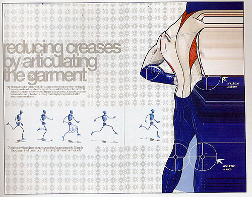
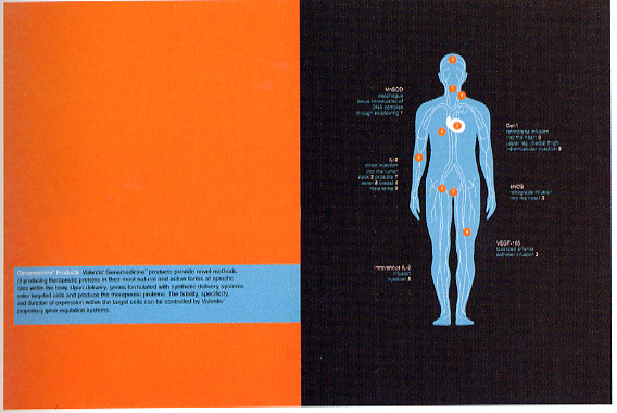
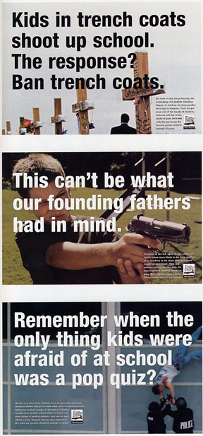
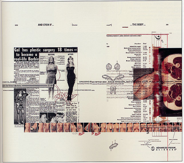
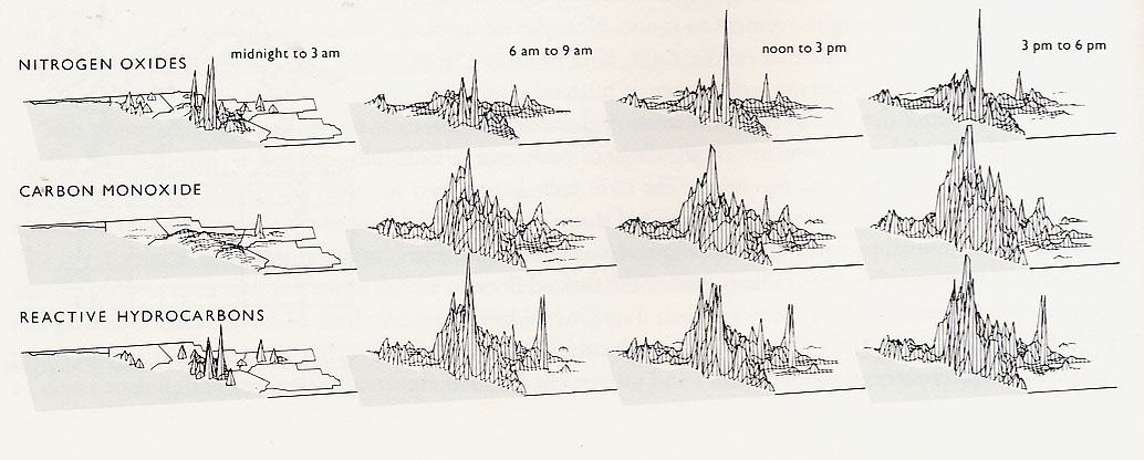
This set of images may closely match what the
project is asking for -- take note!
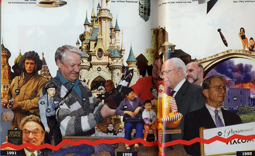
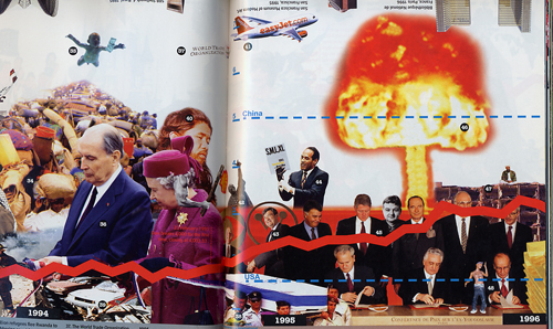
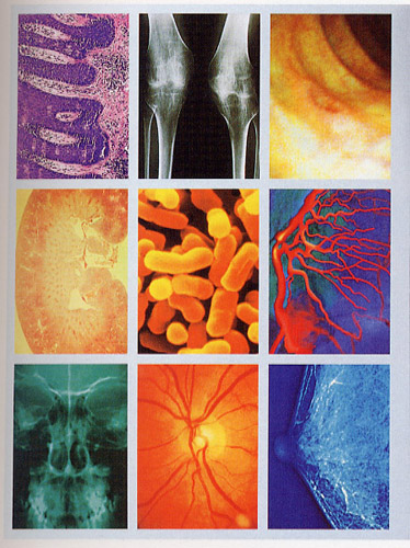
Notice the "montage" effect, with multiple
layers of information.
Note how much information we actually get from
a piece like this...
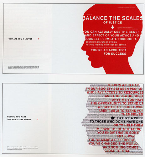
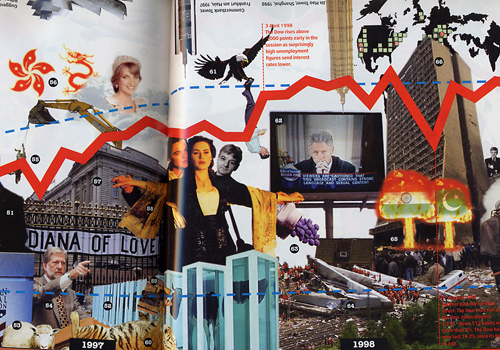
Subtle use of color is used to direct the eye
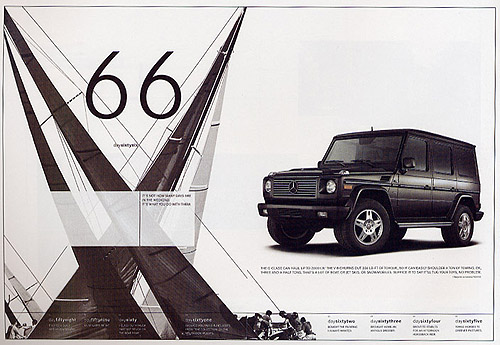
You could create a rectilinear space -- or keep things
very logical and precise (it may depend on your subject).
Again, subtlties are the key -- which is easier to read?
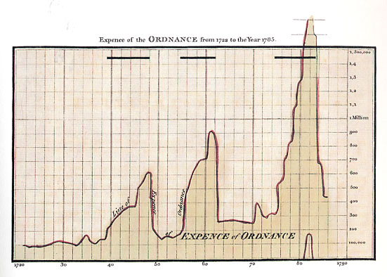
This data actually starts to look "cool" -- can data have an aesthetic?
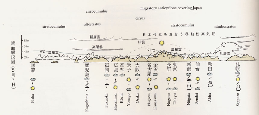
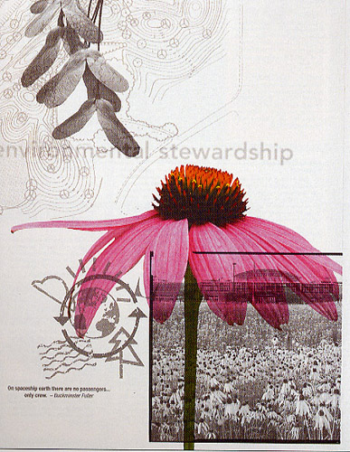
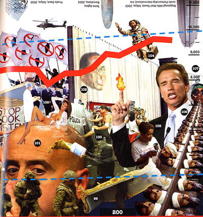
This piece is a great example depicting "Natural" events
Note how it all occurs organically in the same
image without any breaks...
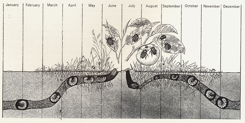
In this case, does the pictorial element really
add to the understanding?
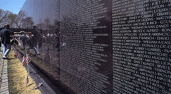
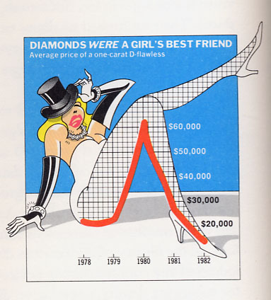
"Data" can evoke deep sentiment
(Maya Lin, 1982)
.jpg)
(Form vs. Function)
Data really can be cool...
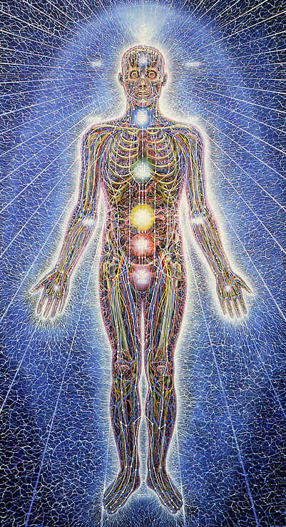
(Alex Grey)
Again, there is no reason why your map
needs to be a "line" -- we don't need
a linear progression in order to
understand time...
What sorts of "montage" shapes could you create?
Even if you explore somethign linear, the resulting shape
could be somehow significant or different?
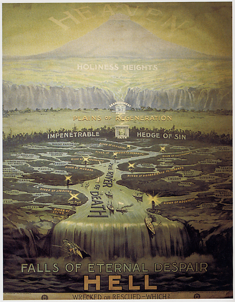
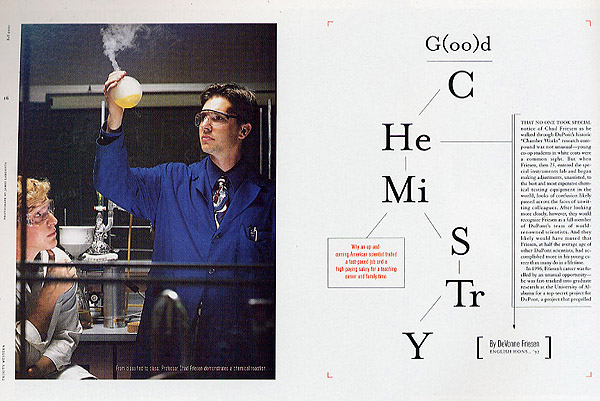
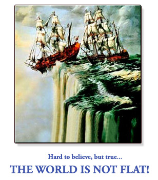
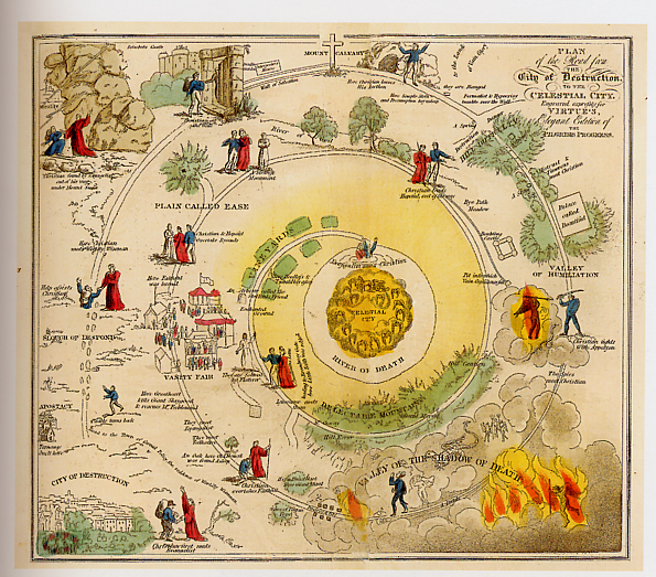
This piece uses a map to offer a lesson in morality
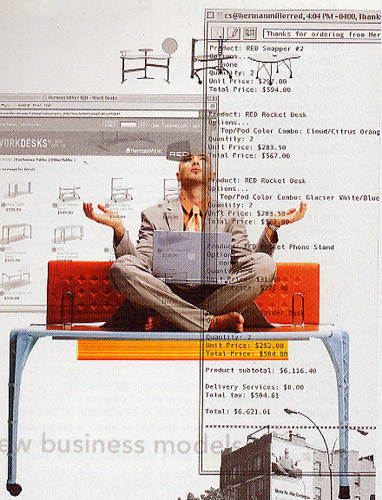
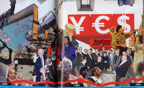
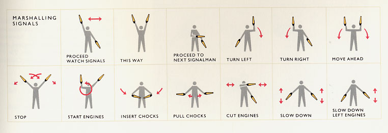
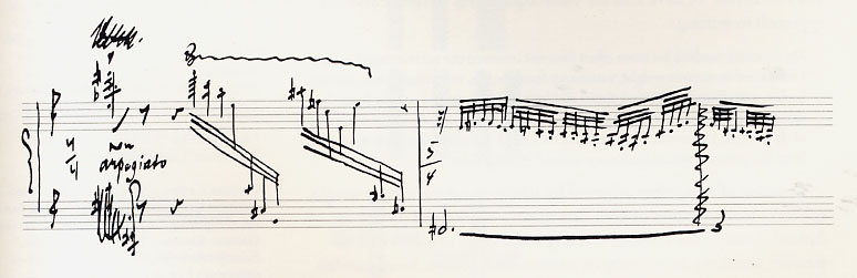
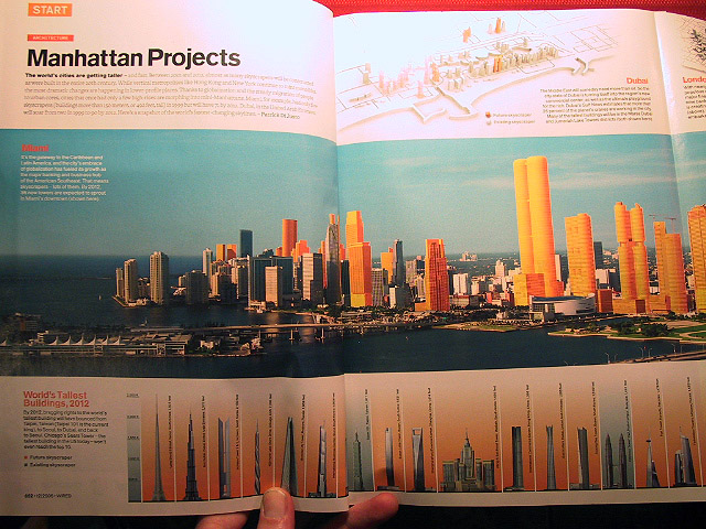
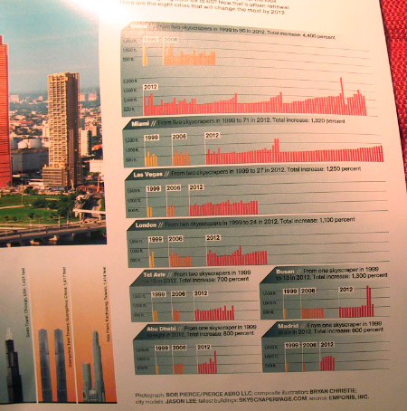
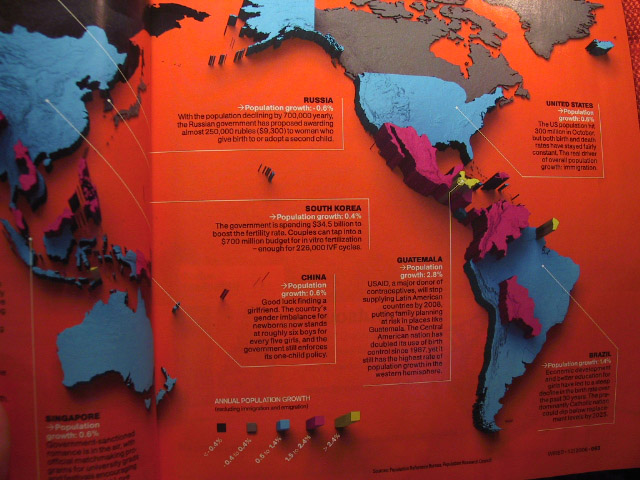
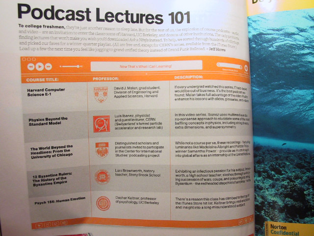
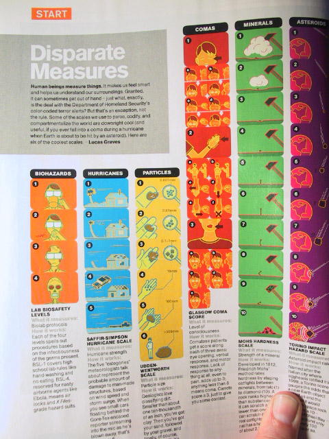
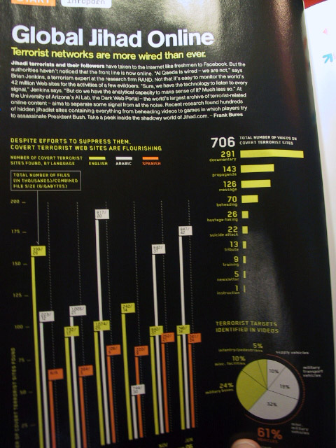
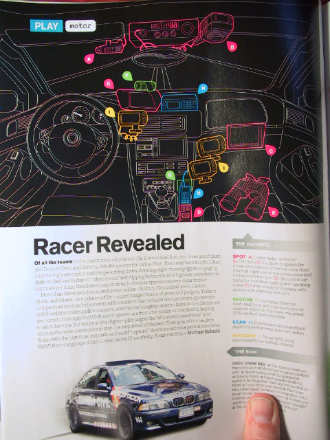
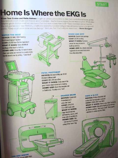
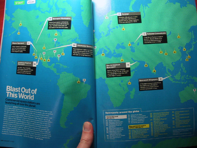
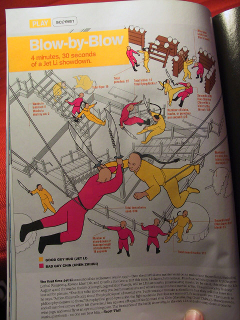
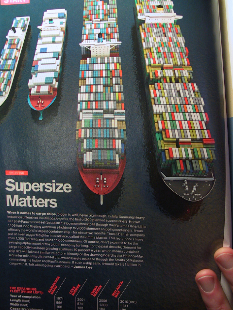
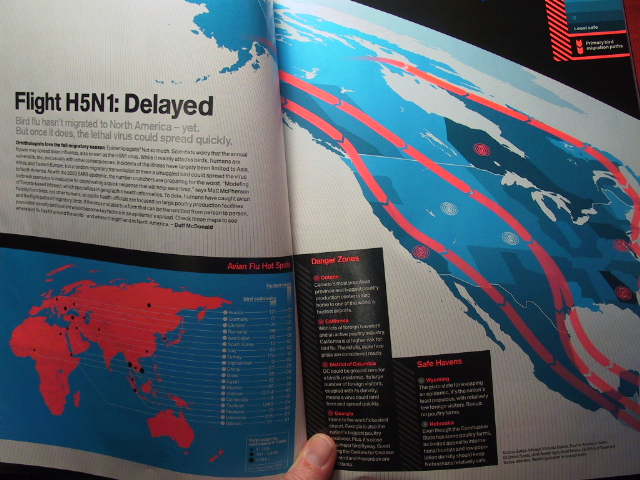
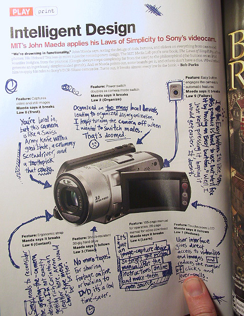
Here
are some "snapshots" from recent issues
of "Wired" magazine, which might also
get you thinking:
(Apologies for the image quality)
General Ideas/Thoughts