???
Perhaps you missed all of the hype? Whether in the recent winter games or in the latest summer installment, the Olympics are no doubt a spectacle. Though they are chiefly experienced as a sporting event, with the eyes of the world and a longstanding tradition of optimism, the games are much bigger. Perhaps you are unaware, but there is a great deal of design involved in packaging the "Olympic Experience," and this is central to sustaining the Olympic narrative. This is one of the highest profile design campaigns in existence -- it's something that will be viewed by millions of people from around the world. Now you will get the experience of designing the key elements necessary for a project of this scale. Your challenge will be to conceptualize and "brand" the 2024 Olympics. More specifically, your challenge is to create, conceptualize,
and design highly-charged graphically driven promotional press materials that will convince the IOC (International Olympic Committee) to choose
your designs for the upcoming games. You will be responsible for developing a logo, a palette, typefaces, and a number of design elements; all in support of a single city and a massive worldwide spectacle.
Keeping in mind the issues we have discussed all semester, this project will be based on multiple pieces. Each
piece will require a host of details, sketches, and mockups, so don’t let
the short list below deceive you. As this is the final project, it is also your final chance to shine.
Employ at least TWO original photographs somewhere in your design. Please note you can use only original photography. This means pictures YOU SHOOT! Absolutely NO web photography, textures, or anything else. In considering a photo subject, you might think about whether you want a general "Olympic vibe" or whether you want a "regional vibe" (or perhaps both?). Think about how this small design will get people excited about the Olympics, about the spectacle and the excitement of the event. Use the photos to help tell the story. Obviously this
will be a challenge if your goal is to portray Olympic glory, or a different region of the world. How can
you capture the spirit without actually having images of the athletes,
the medals, the crowds? How can you capture a sense of different locations while being stuck in Camarillo? You’ll have to be very cunning. If you don't have any photo skills, you can recruit someone in the Art Department or a friend. Think about locations -- the high school track, a swimming pool, the gym on campus, etc. Be creative -- if you think about it, textures and scans could also be considered photographs, right?
Heading into the final weeks of the semester, it will be critical that you end on a high note, and use your time wisely in completing a highly sophisticated and portfolio-worthy design. You will also notice the timeline for the final projects has become more ambitious. Now that we know the tools, we are getting closer to the speed and facility the industry requires for realistic project development. As with all past projects, missing the milestones will have an impact on the final grade. The Milestones:
* * * * * * * * * * * Here are some ideas to get you thinking:
|
The official emblem of Beijing 2008 entitled "Chinese Seal-Dancing Beijing" cleverly combines the Chinese seal and the art of calligraphy with sporting features, transforming the elements into a human figure running forward and embracing triumph. The figure resembles the Chinese character "Jing", which stands for the name of the host city and represents a particularly significant Chinese style. The artwork embodies four messages: - Chinese culture, |
As a representative symbol
projecting a visual image of the Seoul Olympic Games, the
emblem featuring a samtaeguk pattern is seen and recognized
all around the world, along with the Olympic mascot, Hodori. The pattern is well known in Korea, being widely used as a decoration on fans, the gates of Korean-style homes, artifacts and folk crafts. The Olympic emblem
comes in two forms of patterns, |
The 2006 Olympic Winter Games emblem portrays the unmistakable silhouette of the Mole Antonelliana. It is transformed into a mountain, among crystals of ice, where the white snow meets the blue sky. The crystals come together to form a web: the web of new technologies and the eternal Olympic spirit of communion among peoples.

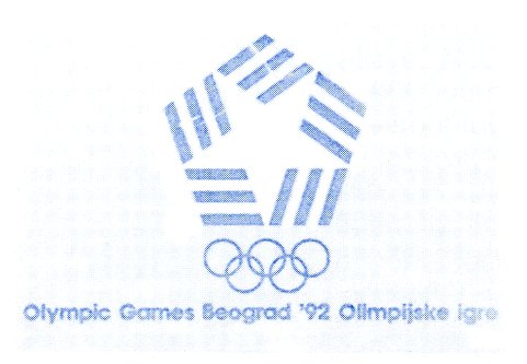
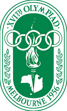
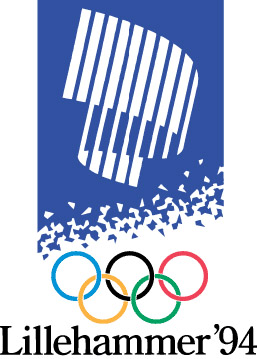
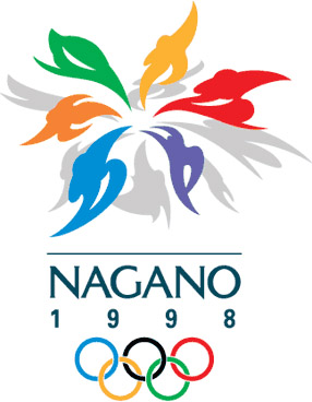




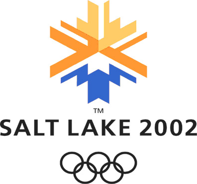
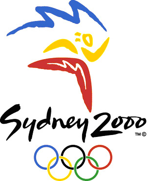
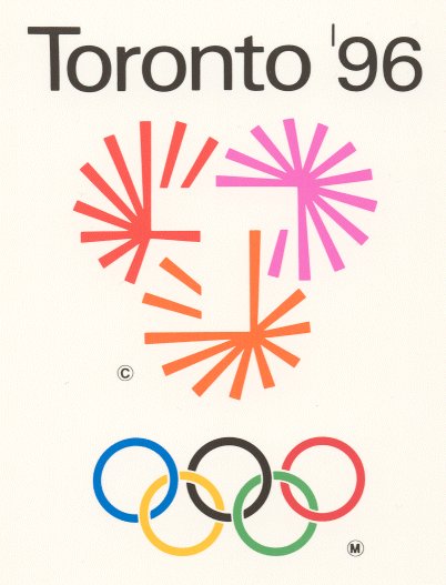

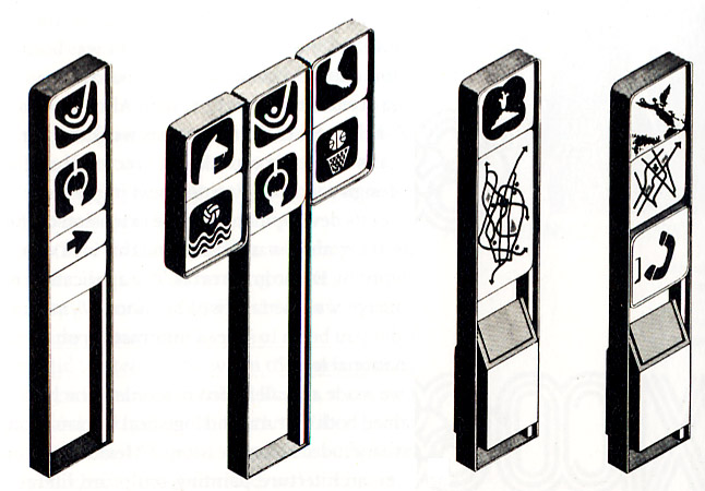
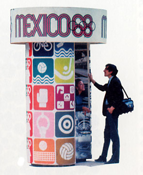
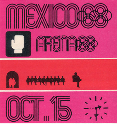
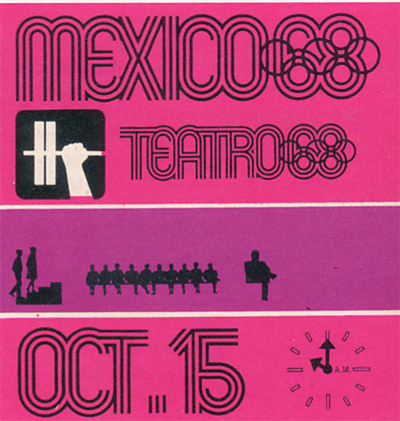
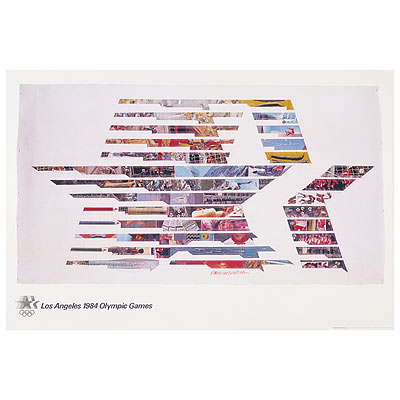
The Olympic graphic identity packages, particularly since the 1968 Mexico City games, have consistently offered some of the most intriguing and memorable designs of the last 40 years. (Design by Lance Wyman, with Alfonso Soto Sorio) |
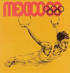
The Olympics, as a venue, force a designer to get right to the heart of the graphic design. Ultimately these designs must communicate and make a connection between people and places -- many thousands of people all converging in an unknown locale. All of the design fits into a cohesive package.
|
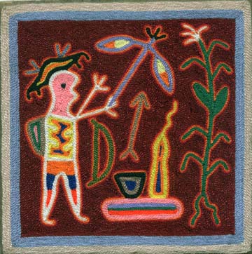
Huichol Yarn Art
A large part of the Olympic design seeks to combine the local cultural history

Op Art
With some sort of contemporary sensibility...
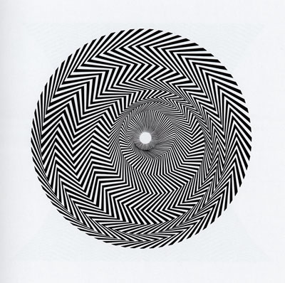
Bridget Riley, Blaze, 1962
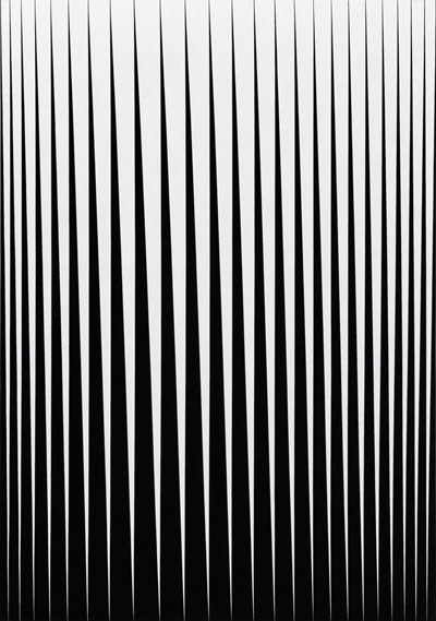
Bridget Riley, Breathe, 1962
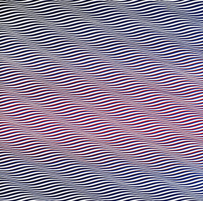
Bridget Riley, Cataract, 1962

Bridget Riley, Descending, 1962
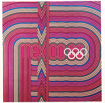
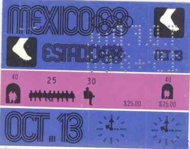
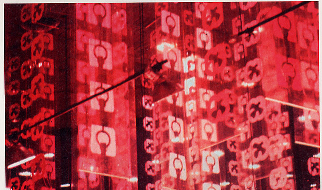
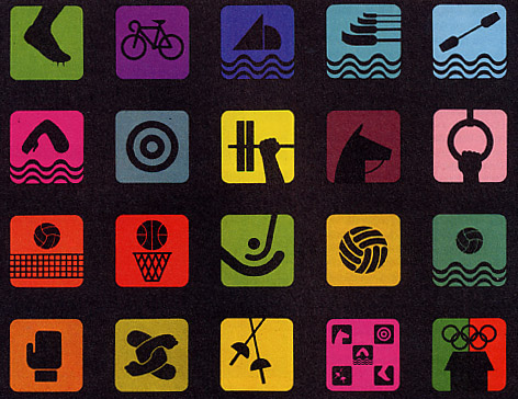
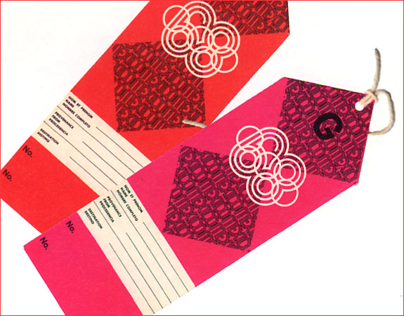
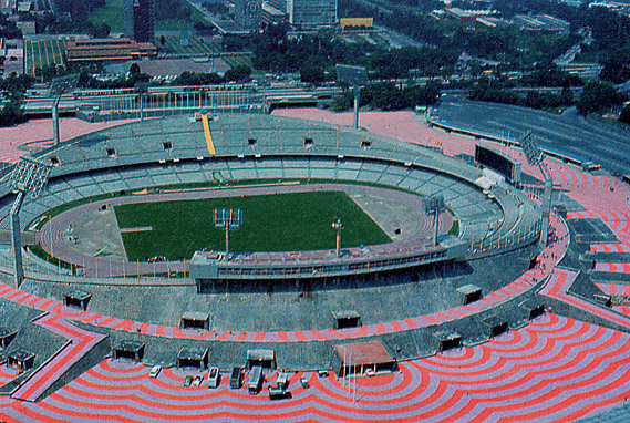
There is a great deal of thought that goes into these emblems -- they are the starting place in packaging the entire games...
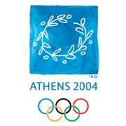
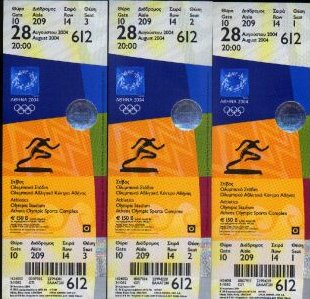
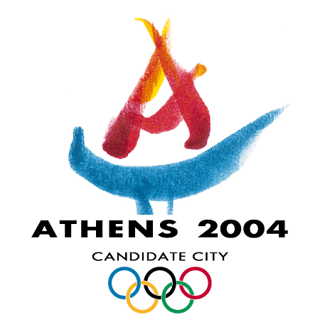
The Athens Emblem The emblem of the 2004 Olympic Games was unveiled to the public on 30 September 1999. The design was selected among 690 entries submitted to the international competition by 242 candidates in 14 countries. The olive wreath: an Athenean classic The ATHENS 2004 Olympic Games emblem is a wreath made from an olive tree branch. It represents the four values of the 2004 Games – heritage, participation, celebration, human scale - in a uniquely Greek design. The olive wreath or “kotinos” is one of the legacies of the ancient Games and was the prize awarded to Olympic champions. The olive tree was the sacred tree and symbol of the city-state of Athens. The wreath has the shape of an open circle; it is an open invitation to humanity to participate in a common endeavor, the Olympic way of life, through the greatest peaceful competition of the world. It is also, a pledge for a universal festival that transcends boundaries and distinctions. The ATHENS 2004 Olympic Games will be a celebration full of energy and excitement in which everyone is invited to participate. The design is rendered by hand in a free and unrestricted manner that highlights the human element. The palette of white and blue reflects the Greek sea and sky, suggesting the fluidity and transparency of water and the brightness of the Aegean light. |
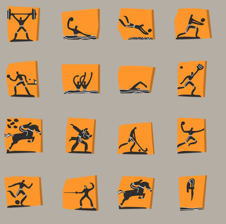
More recently:

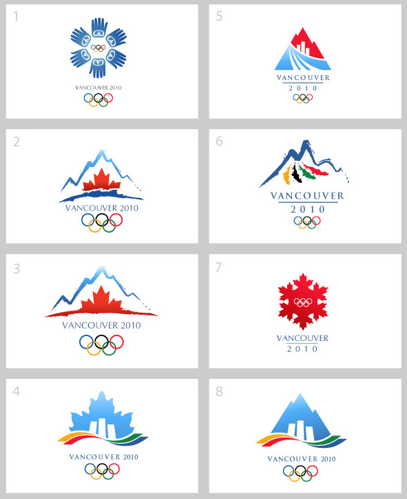
(This is essentially what you should have one week from today!)

The final look...
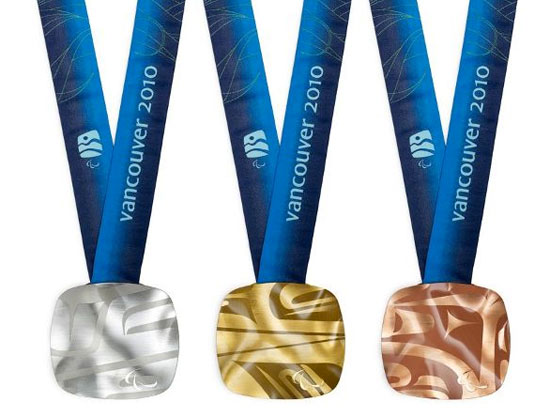

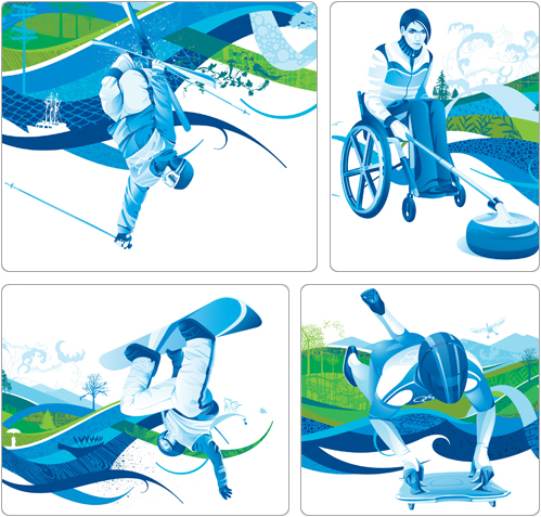
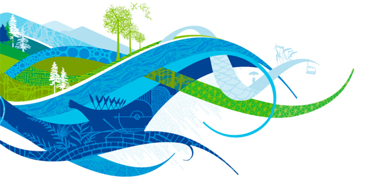
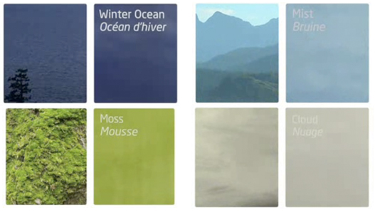

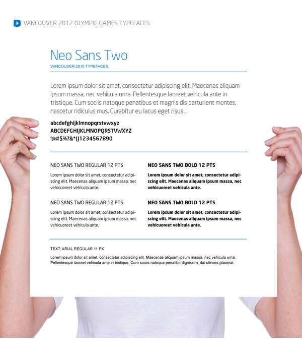
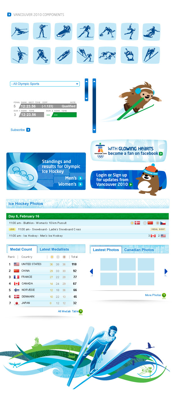
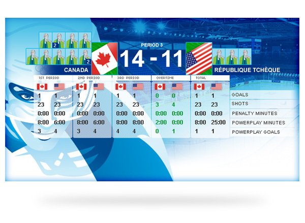


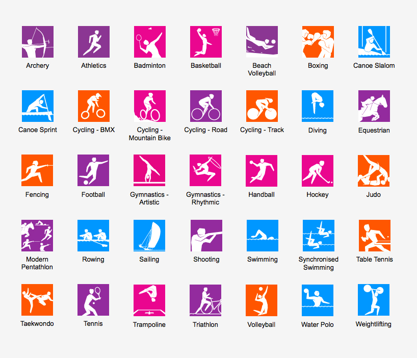
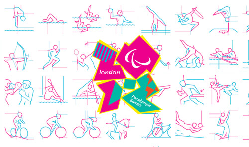
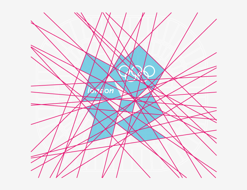
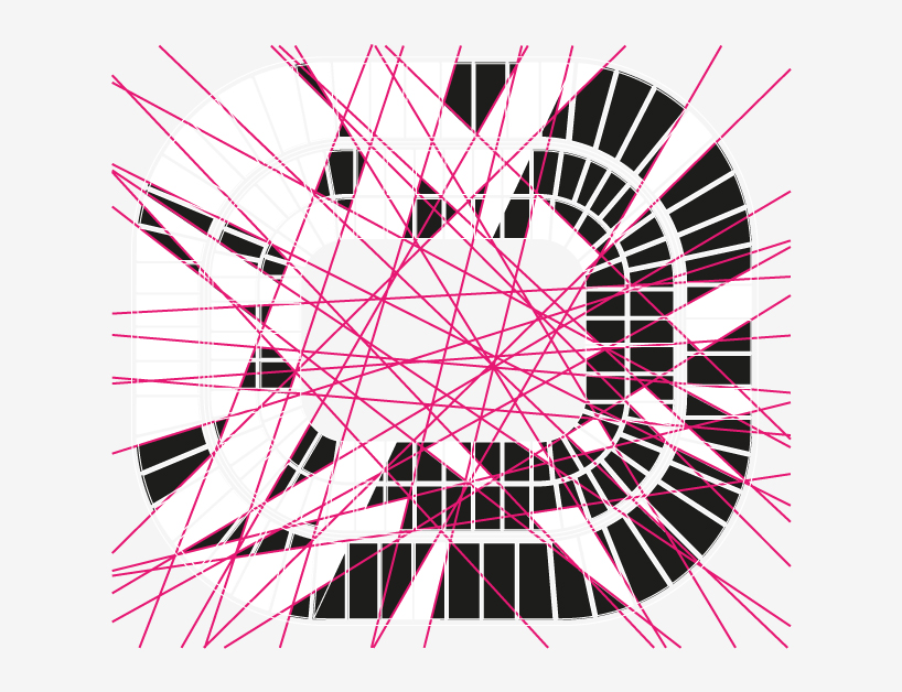
The evolution of the London design:
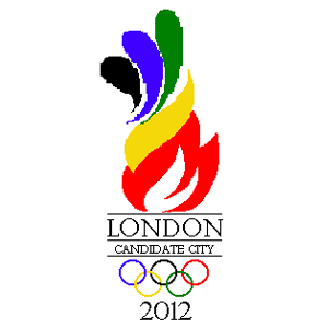


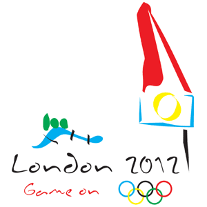
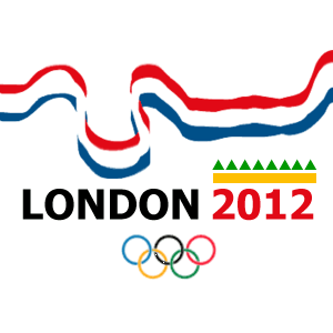
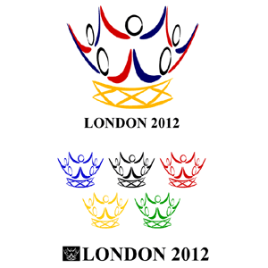
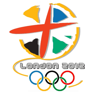
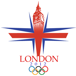
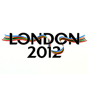
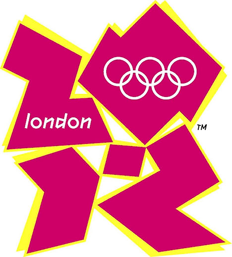
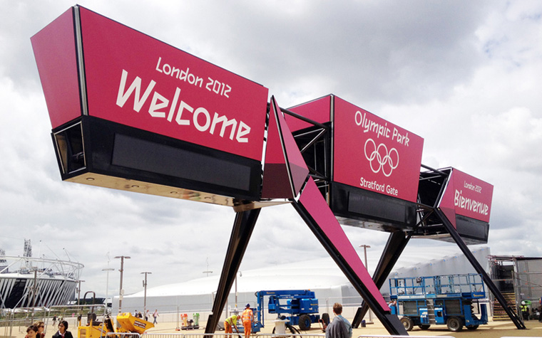
The emblem is 2012, an instantly recognizable symbol and a universal form one already closely associated with the games in london. it is unconventionally bold, deliberately spirited and unexpectedly dissonant, echoing london’s qualities of
a modern, edgy city.
Containing neither sporting images nor pictures of london landmarks,
the emblem shows that the games are more than london, more than sport.The games are for everyone, regardless of age, culture and language.
the emblem is designed to be populated, to contain infills and images,
so it is recognizable enough for everyone to feel and be part of london 2012.Wolf Olins

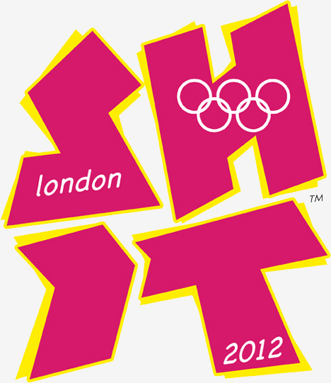
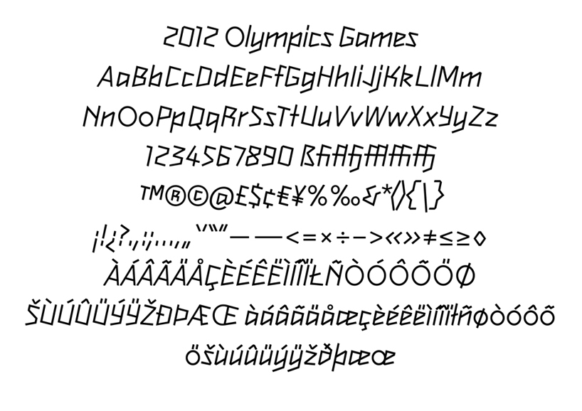
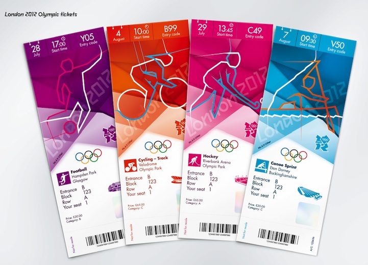
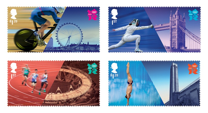
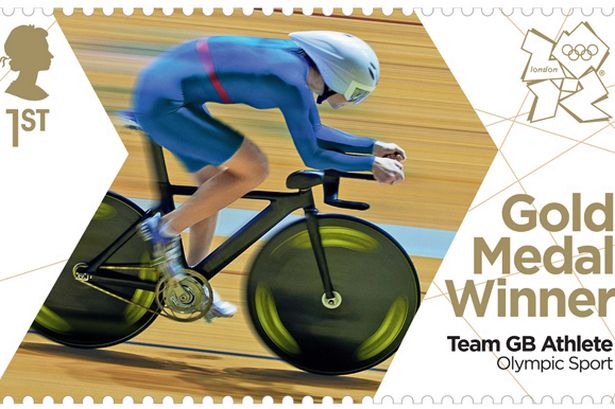


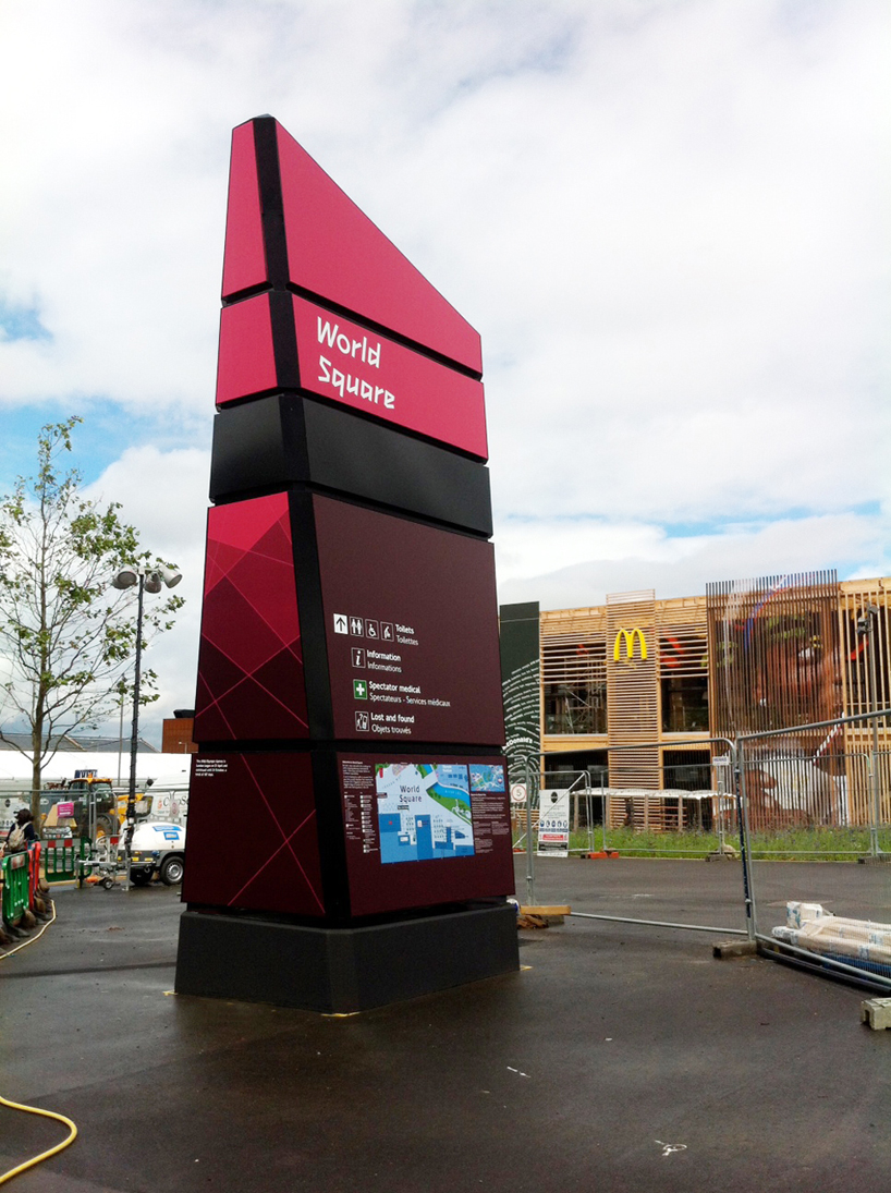
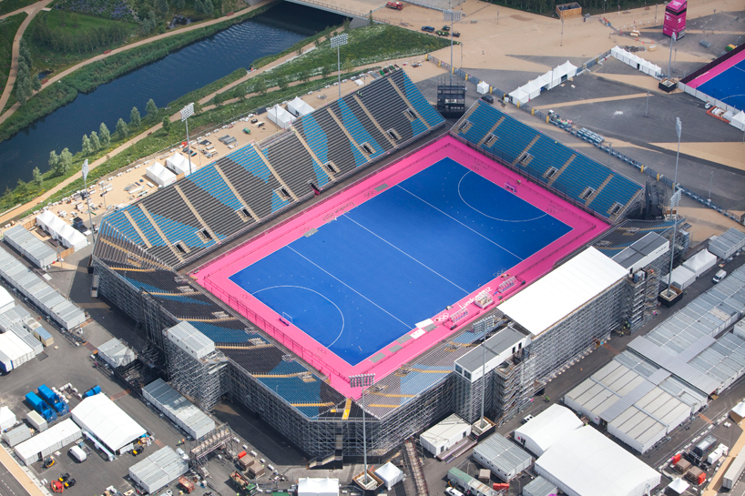
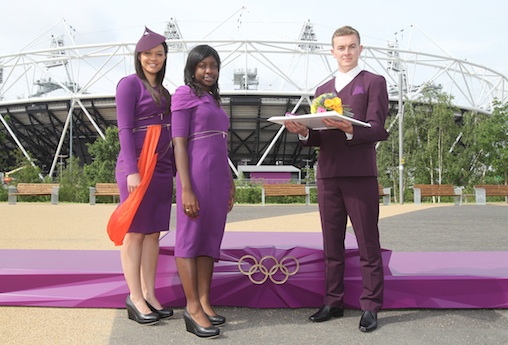

And who could forget?
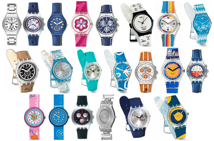
What about those Olympic-themed Swatches?
